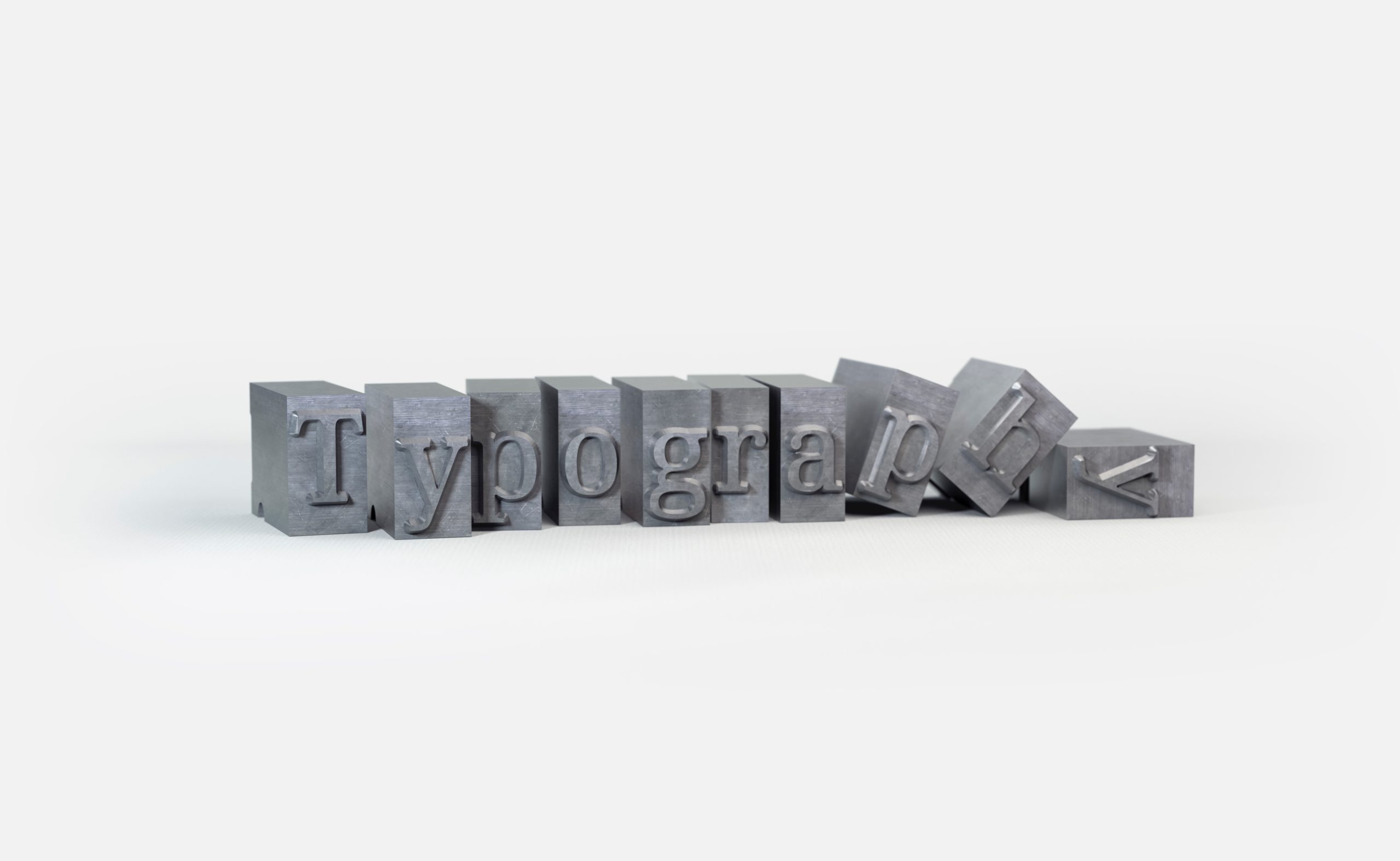
Typography is one of the most fundamental elements in a business visual identity. It establishes a strong visual hierarchy, provides graphic balance and sets the brand’s overall tone.
Nowadays there are thousands of different types available for us to use. That’s why it’s so important to understand the value typography has on brands and even more important the value of choosing the right typography for your brand and its correct usage.
What is the value of typography?
There are different elements that determine the value of typography for a business or a brand.
-
Typography strengthens your brand recognition
Unique, consistent and well-used typography helps establish a strong customer following, build trust with your audience and help carry your brand forward. It not only enhances the brand’s personality, but your customers will subliminally begin to associate your typeface to your brand. So it becomes part your company NDA, bringing differenciation and consistency.
-
Typography improves your brand’s communication
Using different typfaces for different projects, presentations or communications within a company can largely decrease the brand consistency. Having well-designed internal and external communications with the proper typefaces helps mantain a sense of unity within the company, avoinding headaches for employees who don’t want to spend time choosing fonts, and gives consistency and professioanlism externally.
-
Typography holds readers attention
Selecting the correct typeface for your company is essential for approaching your audience. The typeface should be as clean, readable and legible as possible. Typefaces always communicate something to us. To choose a font that communicates the opposite to what the text is saying, it may be counter-productive, right? Fonts should always add value to your texts. They should help reinforce the text message and convey the right mood or feeling.
Different options for different objectives
When creating a corporate project there are different options for corporate typography depending on the objectives. On what elements will this font be displayed, over what digital platform will this font need to be, how will this shape of letter that will represent the type of company.
-
The usage of an existent font
It’s great for projects with small budget. Instead of looking at Google fonts, look for a Digital Foundries that have a typographys. Read carefully the EULA (End User License Agreement) which explains what you can and can’t do with the typgraphy.
-
Modification or ampliation of an existent font
A typeface can be modified or amplified when it’s not enough for the company. Maybe we want a custom version, maybe we need a different alphabet. In this case we have to contact the foundry or the typographer and ask them to work on the missing characters.
-
Creation of a bespoke typography
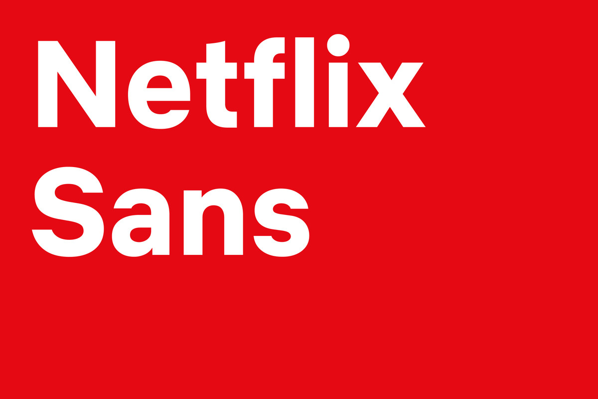
It’s usually for projects that need a differenciation element. And the main value is exclusivity, since nobody will be able to use it but your company. The initial investment is important, but it’s better in the long term, because then you stop paying licenses to foundries. There are a lot of big brands that are choosing to create a bespoke typography. For instance, Coca-Cola created its bespoke typeface because they were paying around 3 million dollars anually to the font provider for the usage of Helvetica, their old corporate font. Even Netflix now has its own custom font called Netflix Sans.
Via It’s Nice That
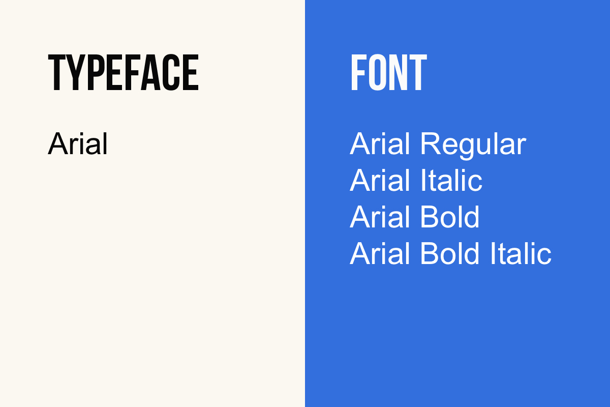
Difference between font and typeface
A typeface is an entire family of fonts. It comprises characters of varying size and weight. A font is a member of a typeface, being a graphical representation of a text character. Fonts refers to weights, widths and styles that constitute a typeface.
How to choose the right font for your brand?
Before choosing a typeface we need to know a few things:
-
Determine usage
We need to know in which communications, it’ll be used in how many devices, in how many languages… Anything related to the usage of the typeface is useful to narrow down our choice.
-
Match your brand’s personality
It’s mandatory the typography reflects your personality. Having defined the brand’s core values help to identify the correct typefaces that reflect those traits.
-
Think about the tone
It’s equally important to reflect the tone of the message. For example, if you want to send a serious information it’s better to choose a font that is clear and not decorative or stylized, since you want to avoid distraction and make the text legible.
It is really a challenge to pick up the right font for your brand or project. If you already have a business but you’re not happy with the branding, or if you are planning to build a new brand or product, contact here.
It’s a designer’s job to build the visual language of a brand, so trust an expert to do the job for you.