Paula Pons logo

Services
Brand Identity
Packaging

Industry
Home & Lifestyle

BOURTON PREMIUM SLEEP

BRAND IDENTITY
2021

Bourton Premium Sleep is a premium bedding brand based in Spain, specialising in high-quality duvets crafted for customers worldwide. Rooted in comfort, quality, and craftsmanship, the brand identity is designed for those who value both quality and calm in their sleep environment.

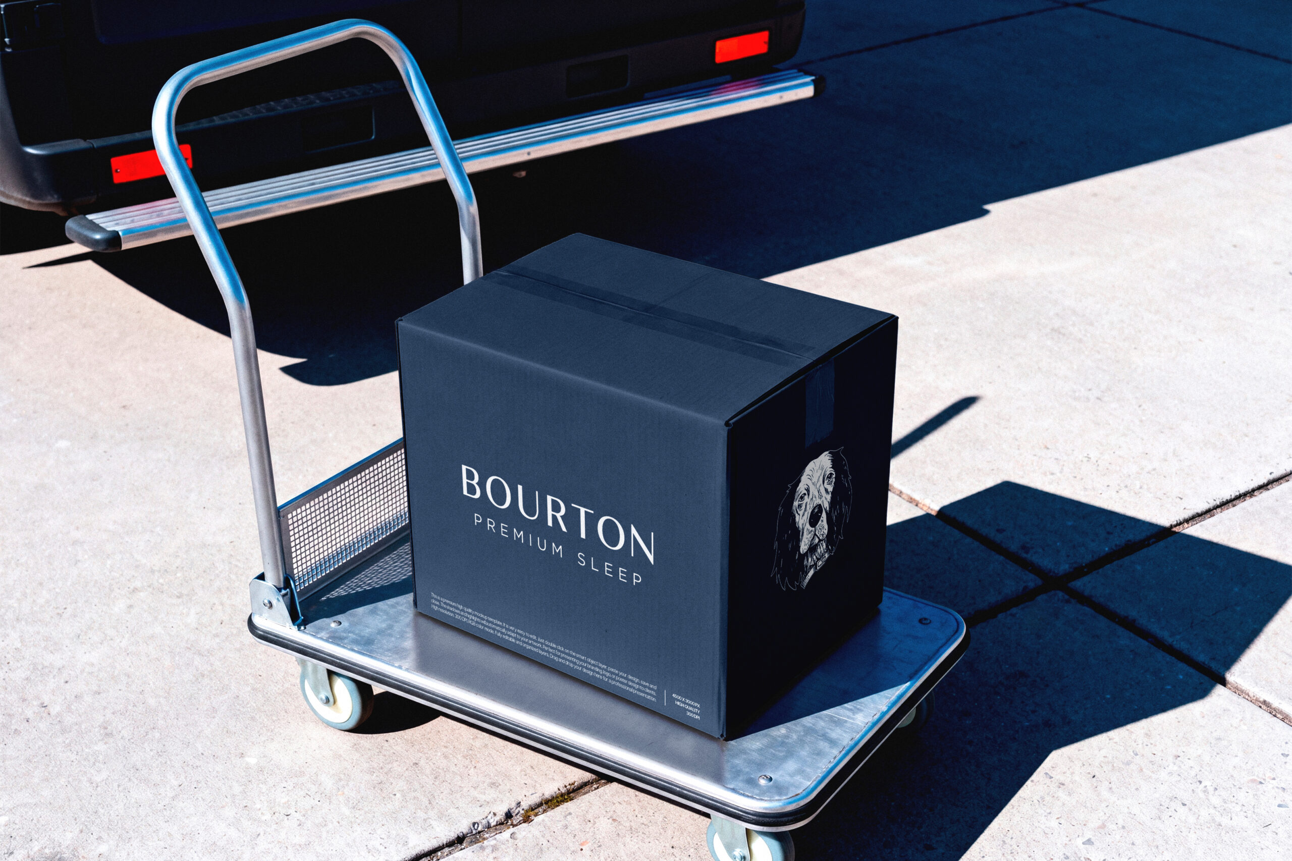
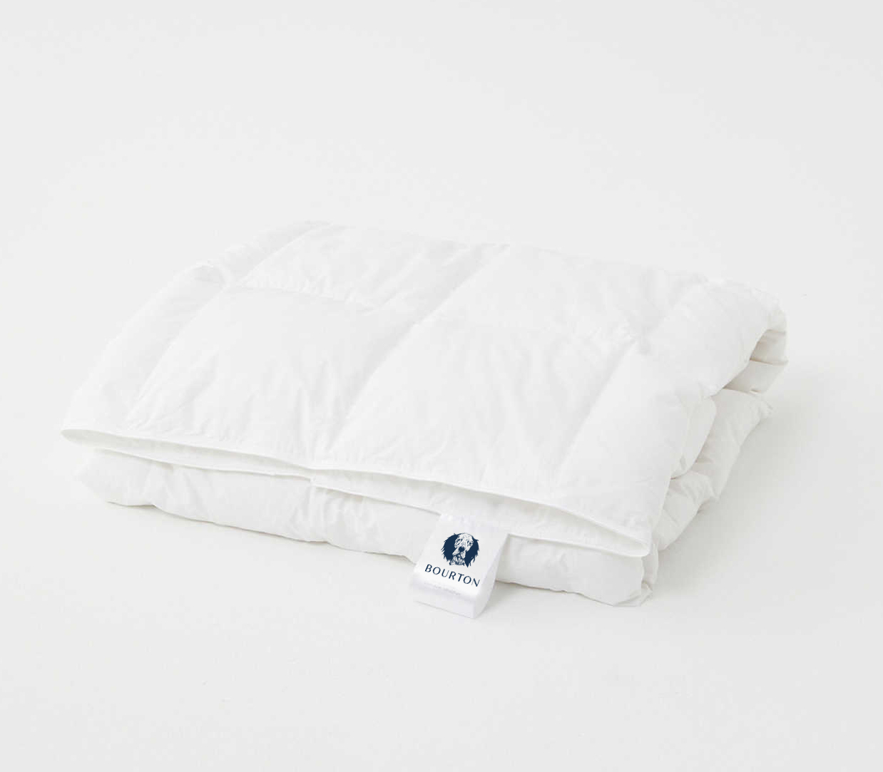
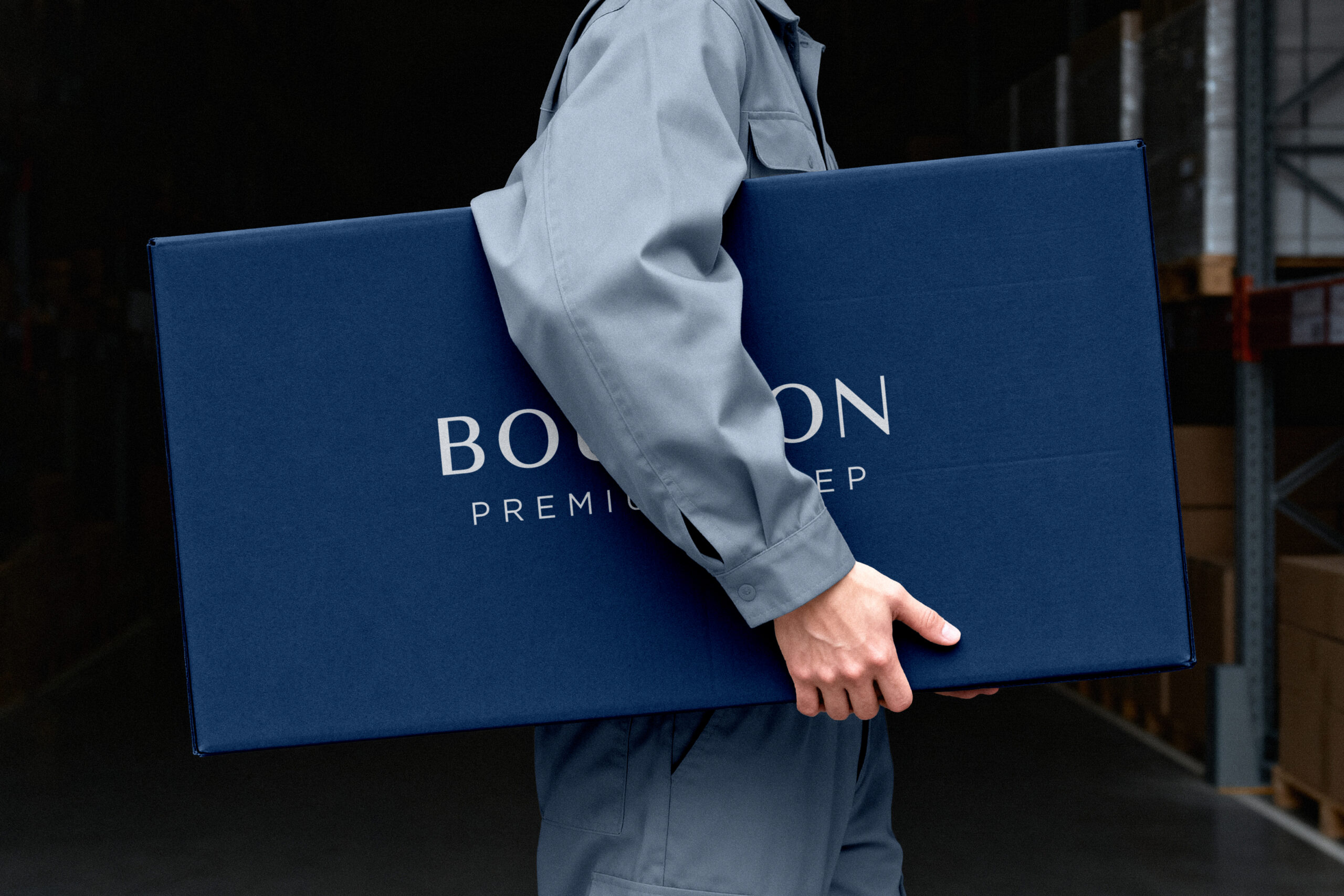
The project involved creating a distinctive and premium bedding brand identity and Packaging system that translated the company’s expertise into a memorable and premium brand experience.

THE CHALLENGE

After years of designing and manufacturing premium duvets for other brands, the company decided to launch its own. The challenge was to create a distinctive and memorable brand identity that reflected the company’s values, craftsmanship and commitment to quality while establishing a clear position in a competitive market.

The visual identity needed to express premium quality with warmth, simplicity and contemporary aesthetics, creating a brand customers could trust and remember.

THE STRATEGY

I developed the new identity to establish a strong market position and a distinctive visual presence. Inspired by the owner’s English Setter (a breed known for its calm temperament and elegant silhouette) the identity draws on a personal story to express the company’s values of quality, warmth and craftsmanship.

The visual identity needed to express premium quality with warmth, simplicity and contemporary aesthetics, creating a brand customers could trust and remember.

THE SOLUTION

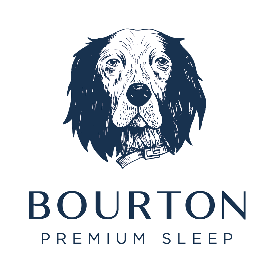
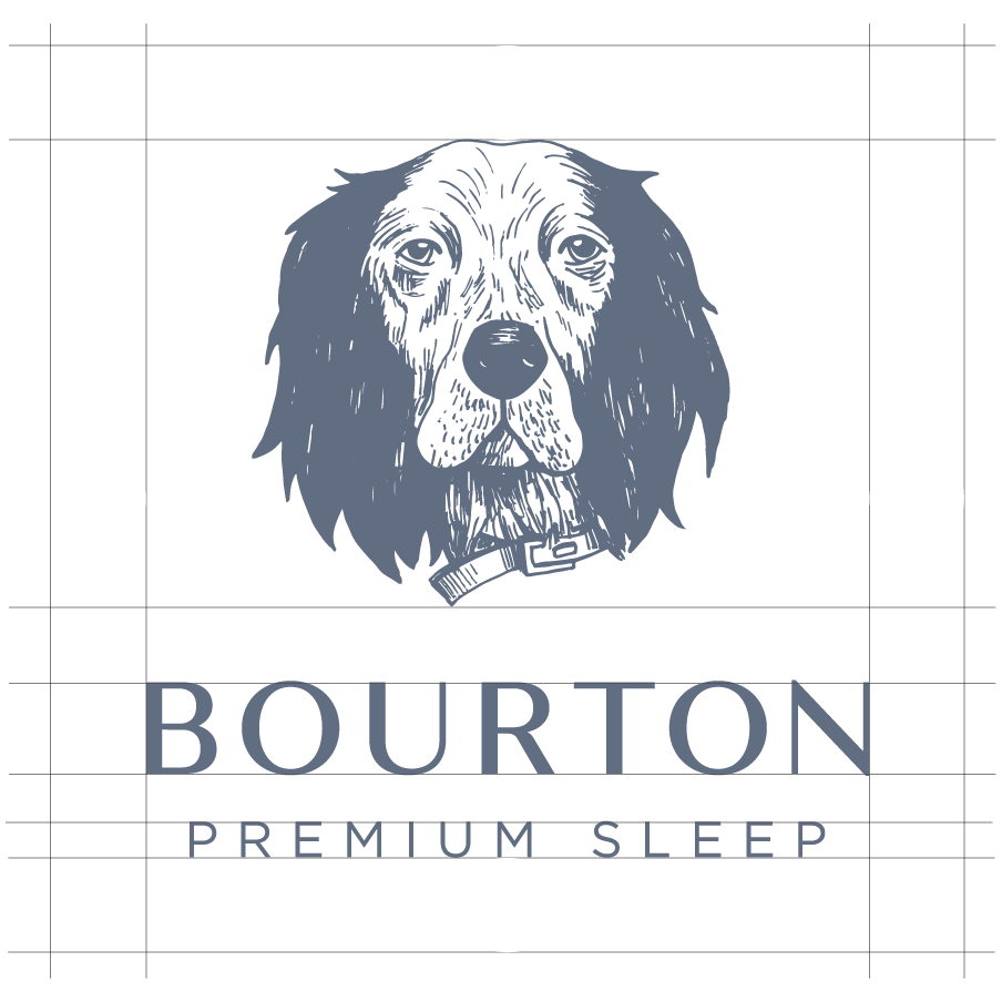
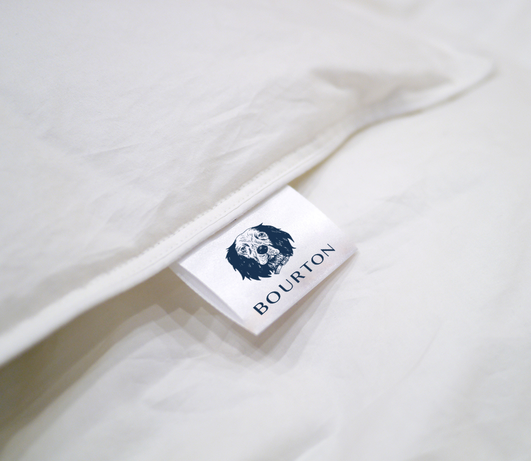
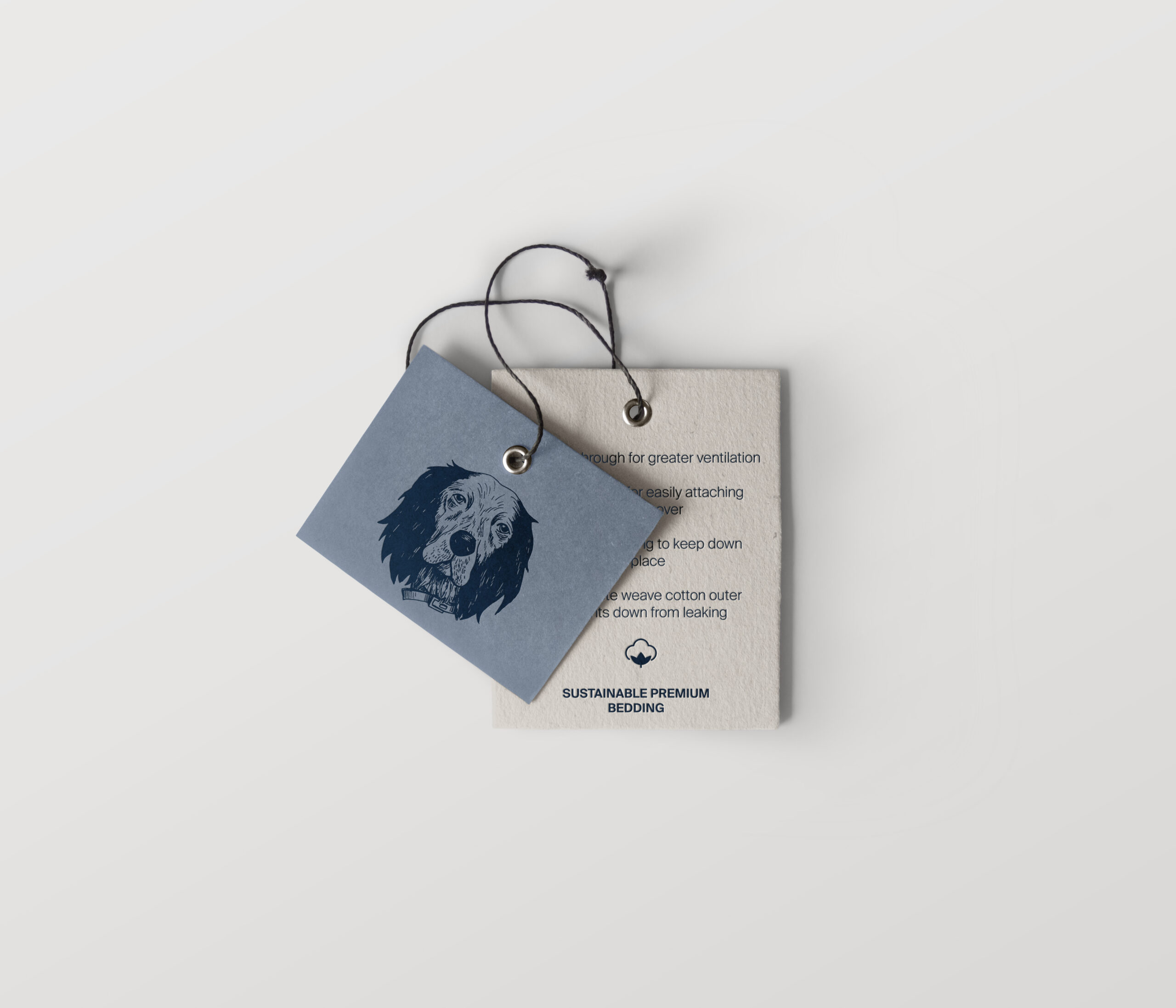
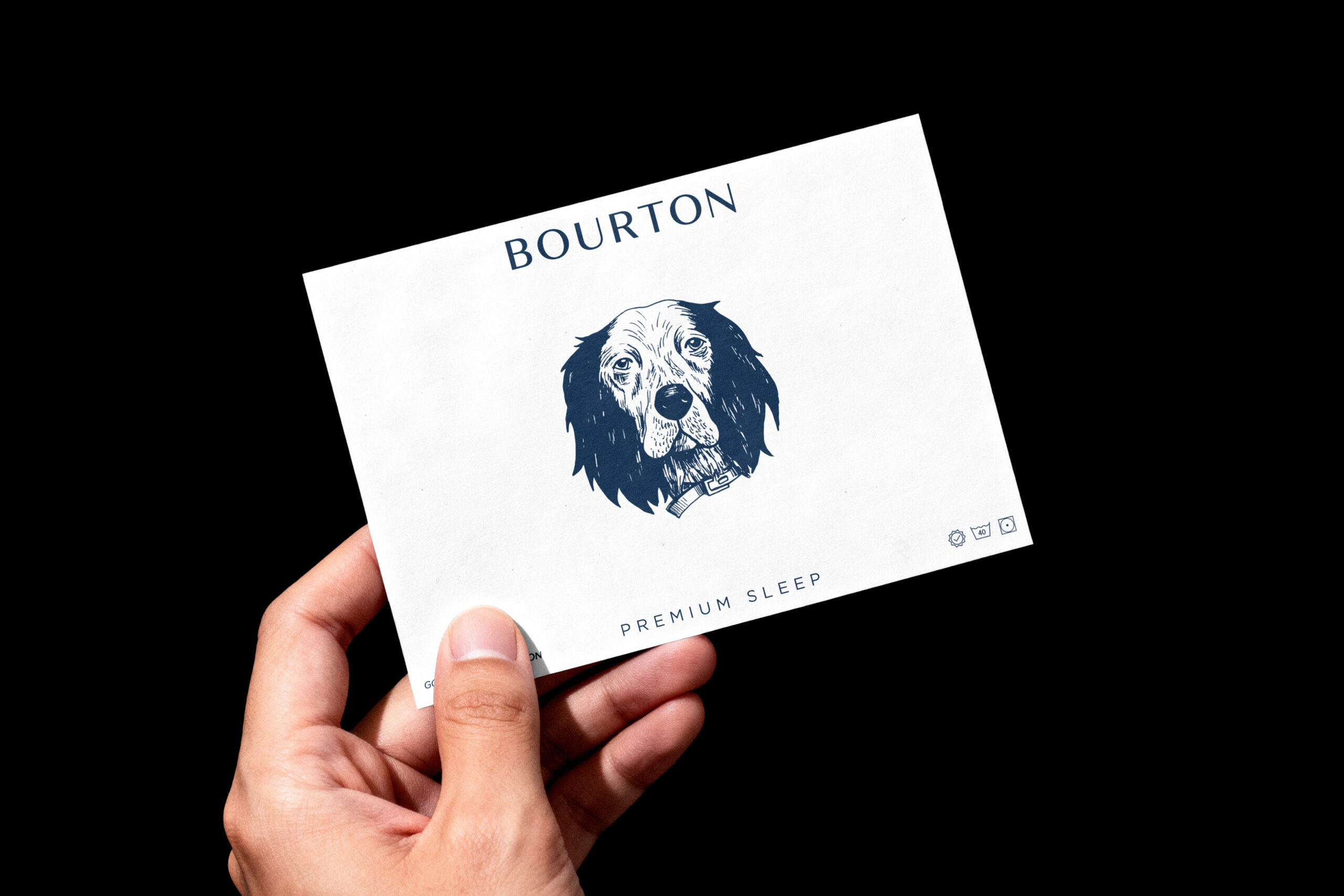
The visual identity is anchored by a hand-illustrated logo that captures the dog’s grace while introducing a timeless character that reflects the company’s heritage and years of expertise. The result is a distinctive and memorable visual identity that feels personal, refined and instantly recognisable.

I chose a rich navy blue as the primary brand colour to reinforce the brand’s premium positioning while conveying trust, quality and confidence. Combined with a restrained colour palette and refined yet modern typography, it creates a visual language that feels elegant, enduring and approachable across every touchpoint, from packaging to digital applications.


The result is a distinctive and premium bedding brand identity that reflects Bourton Premium Sleep’s expertise, craftsmanship and commitment to quality. By combining strategic thinking with a distinctive visual language, Bourton Premium Sleep gained a cohesive brand identity designed to grow consistently across packaging, digital and future brand communications.