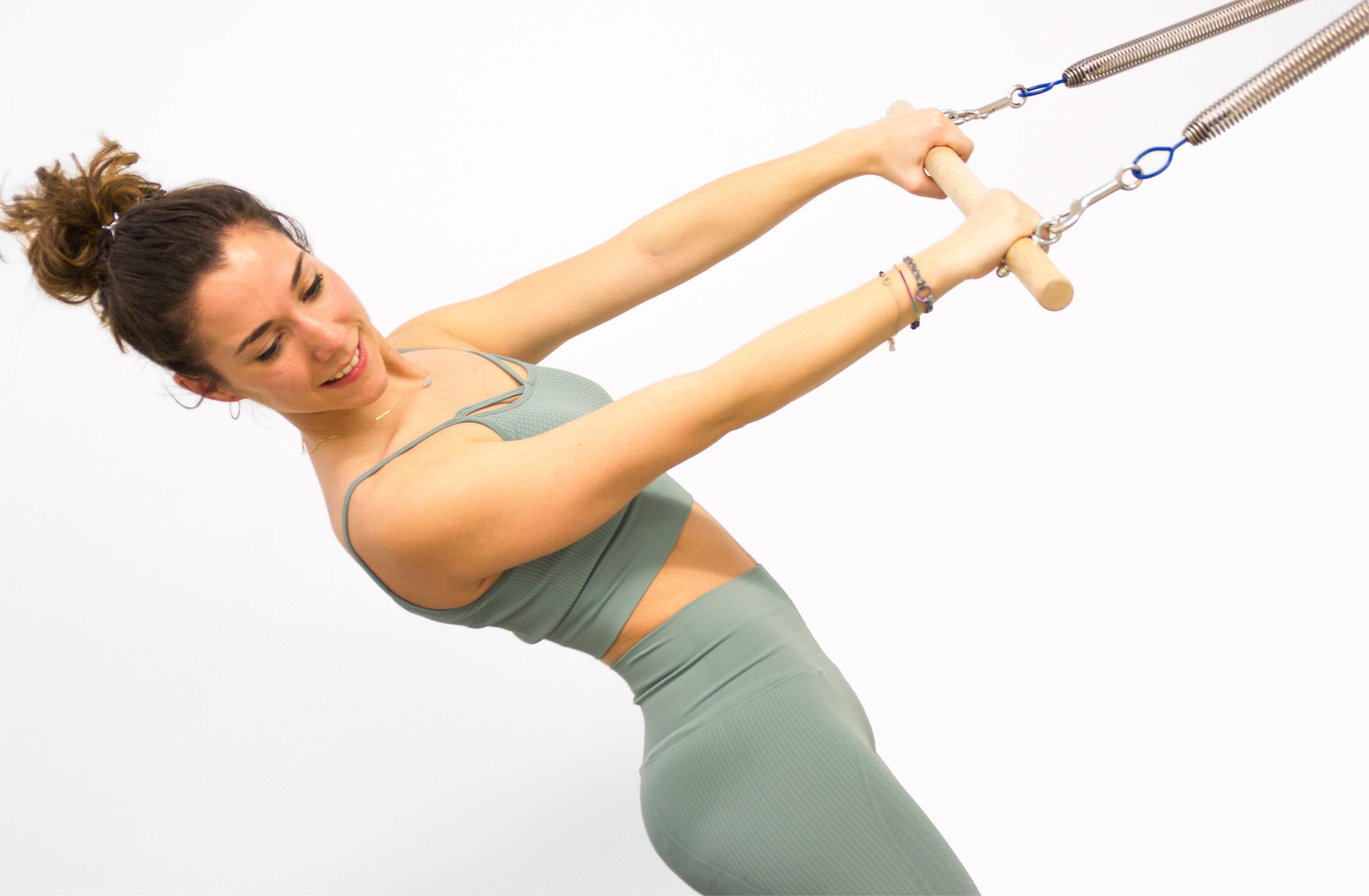
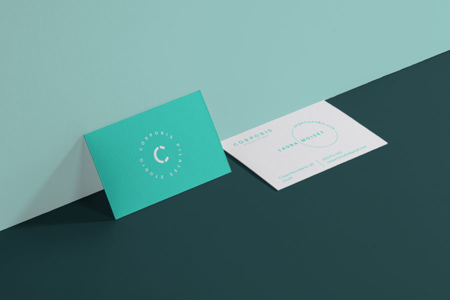
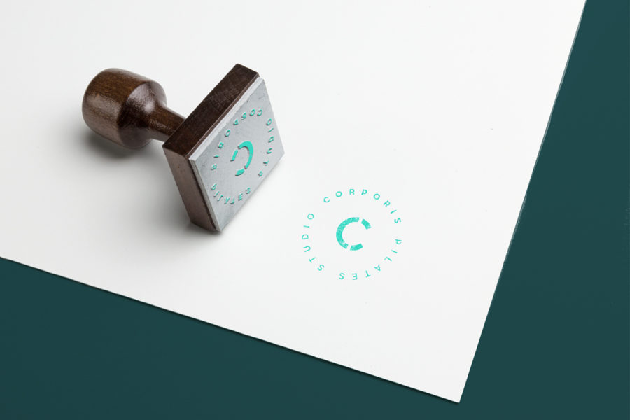
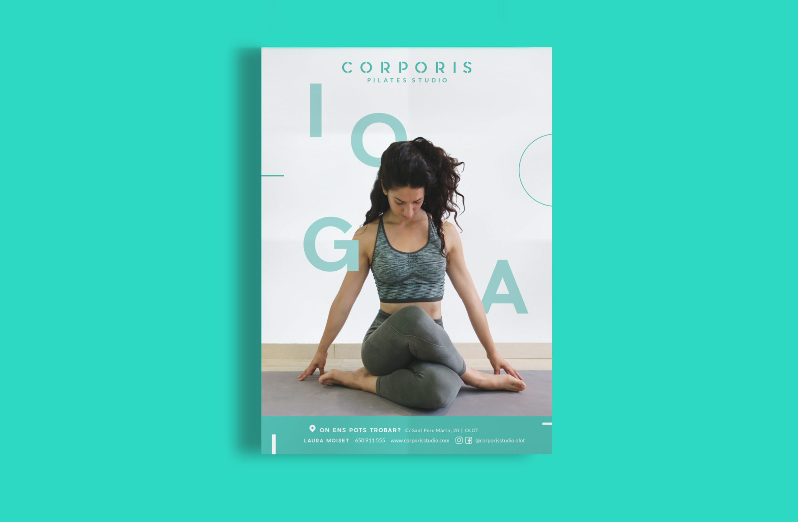
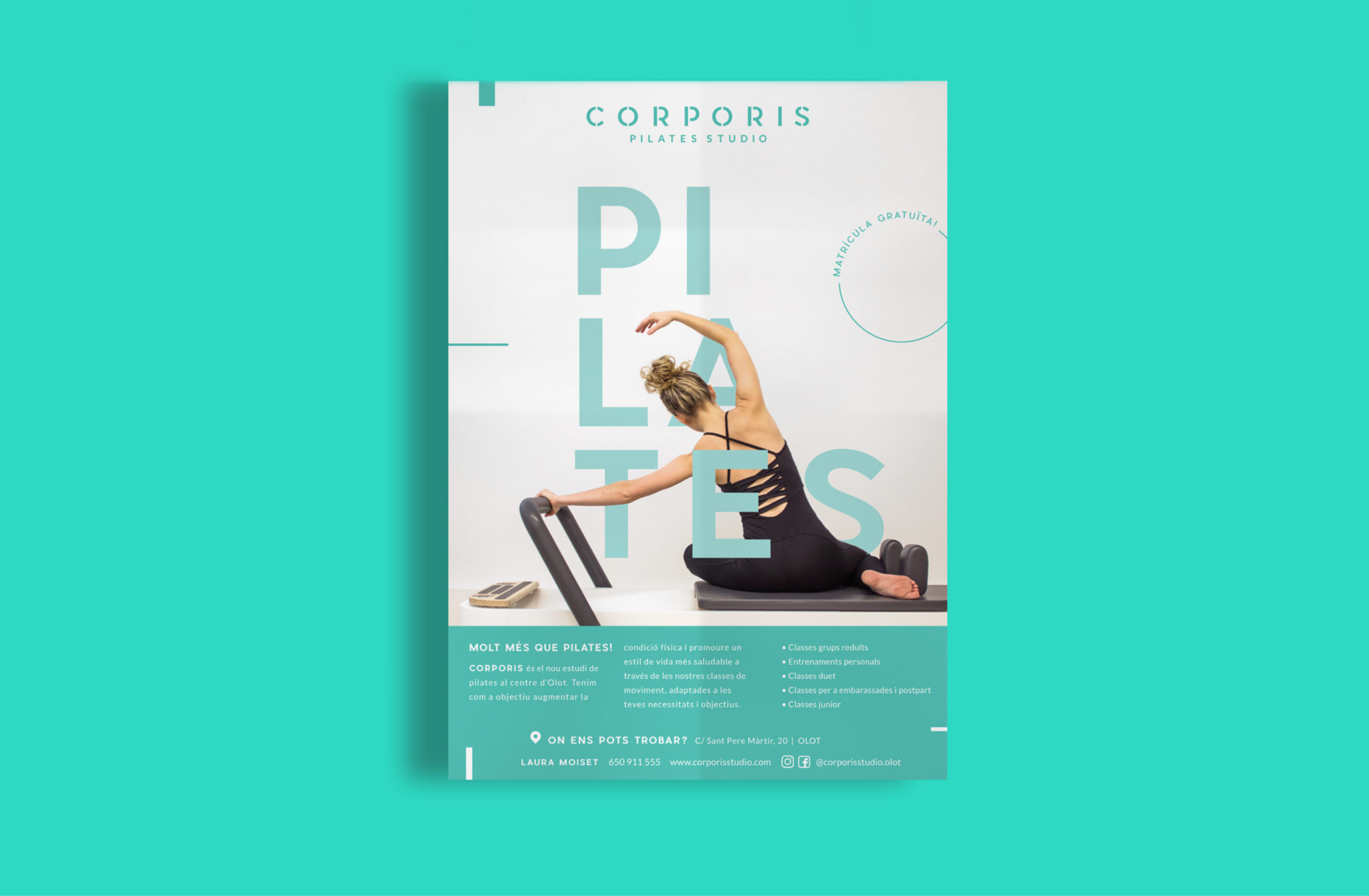
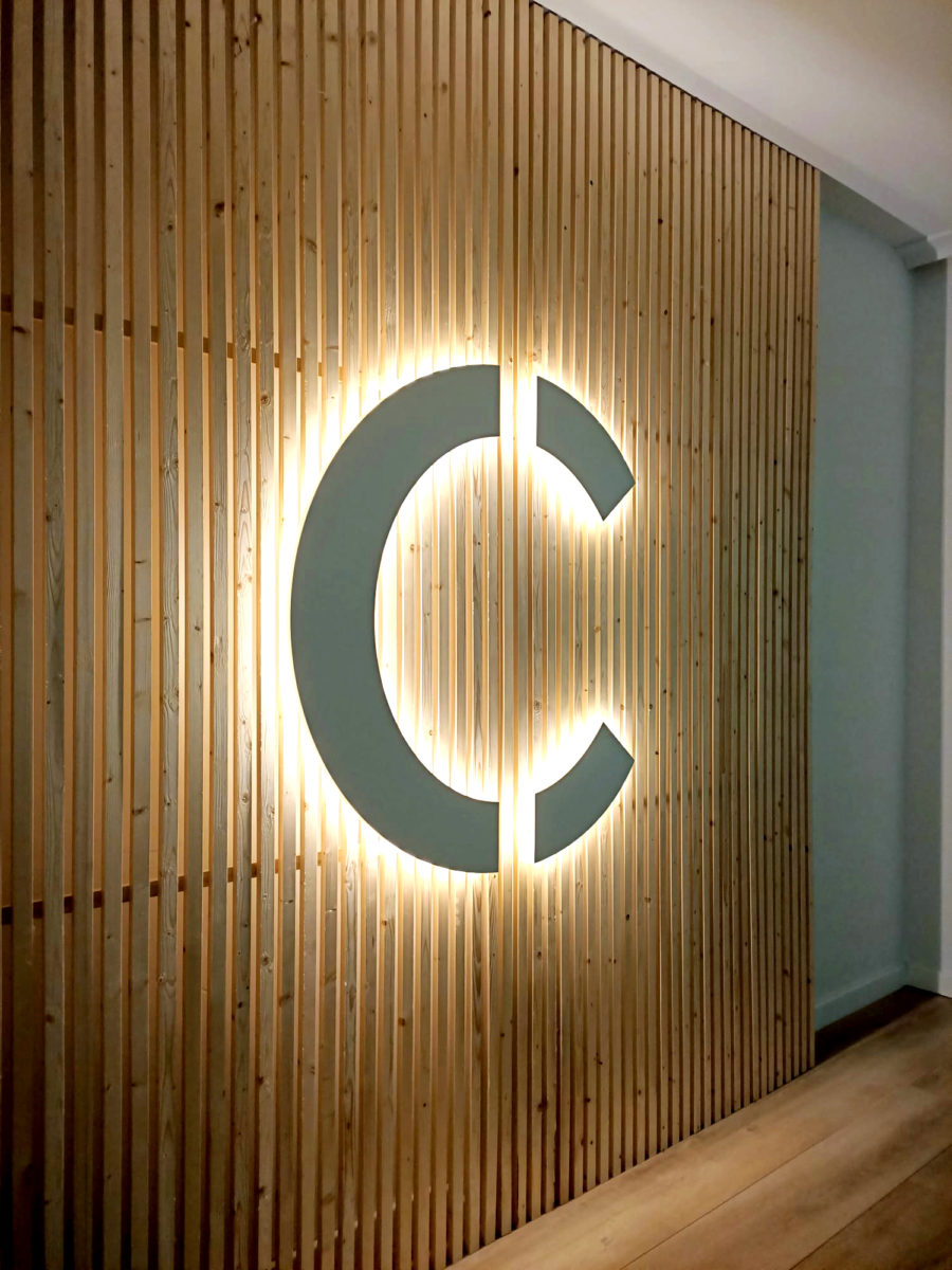
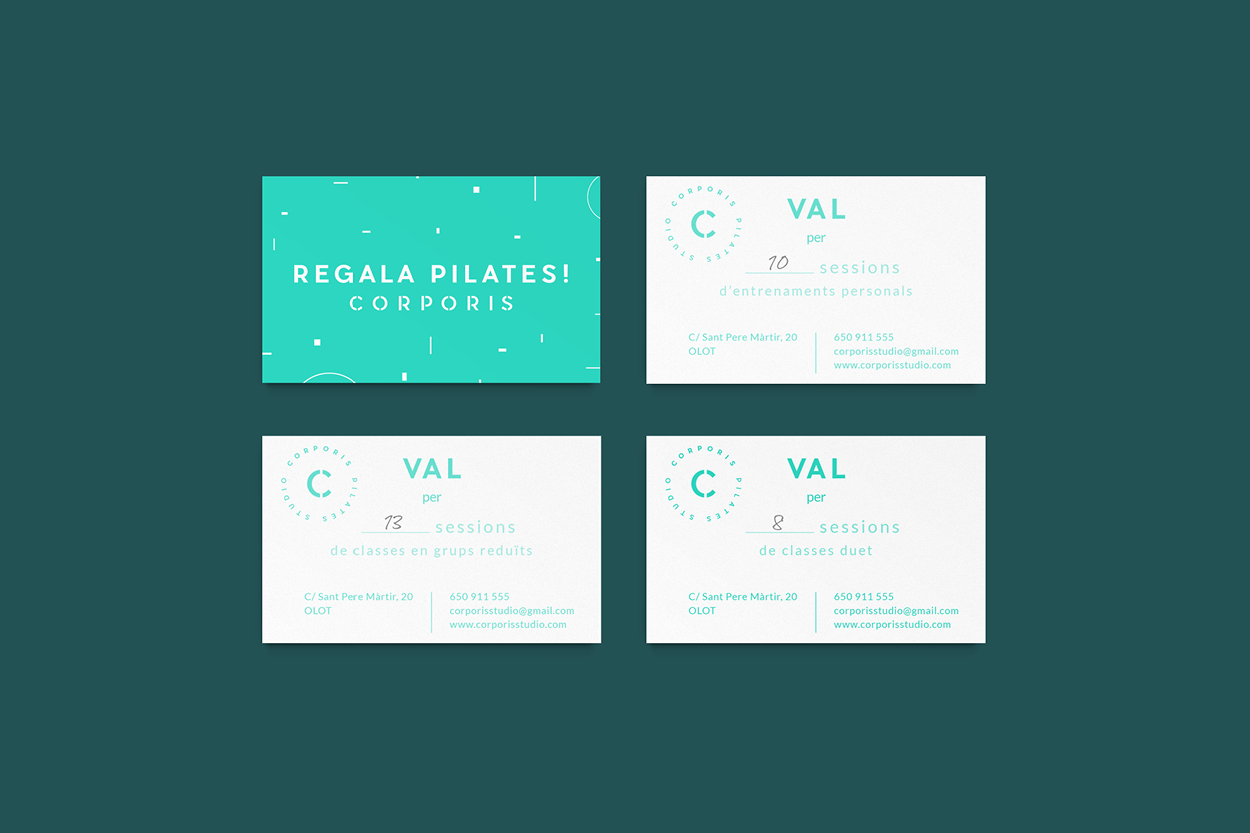
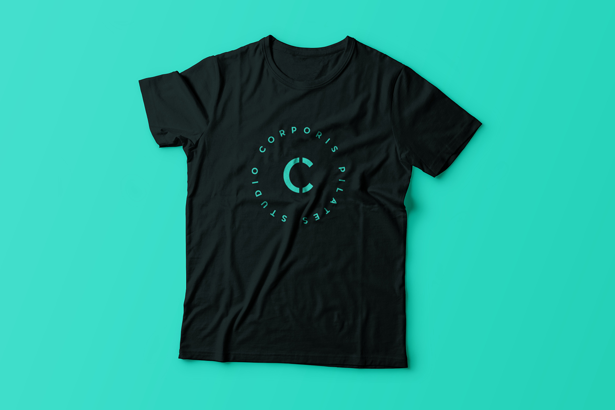
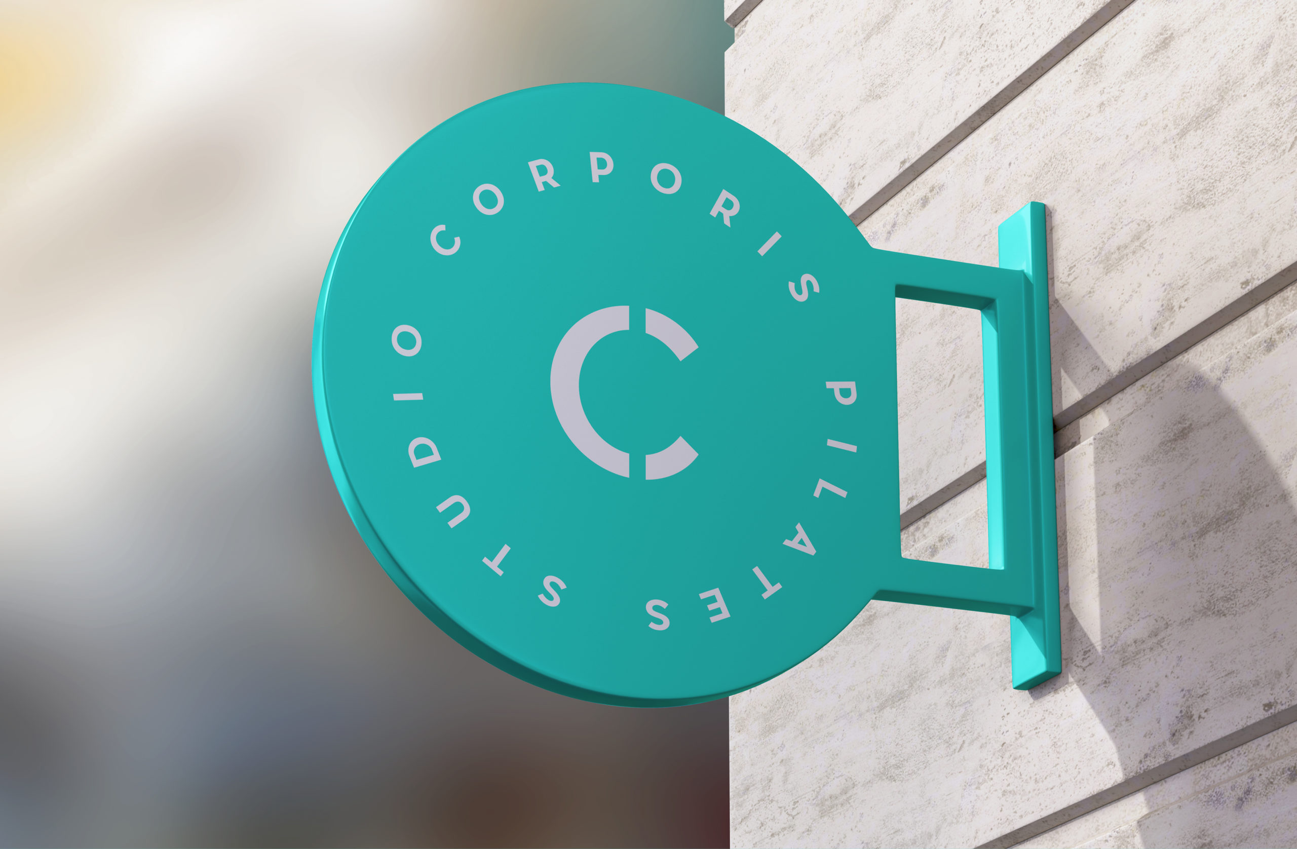
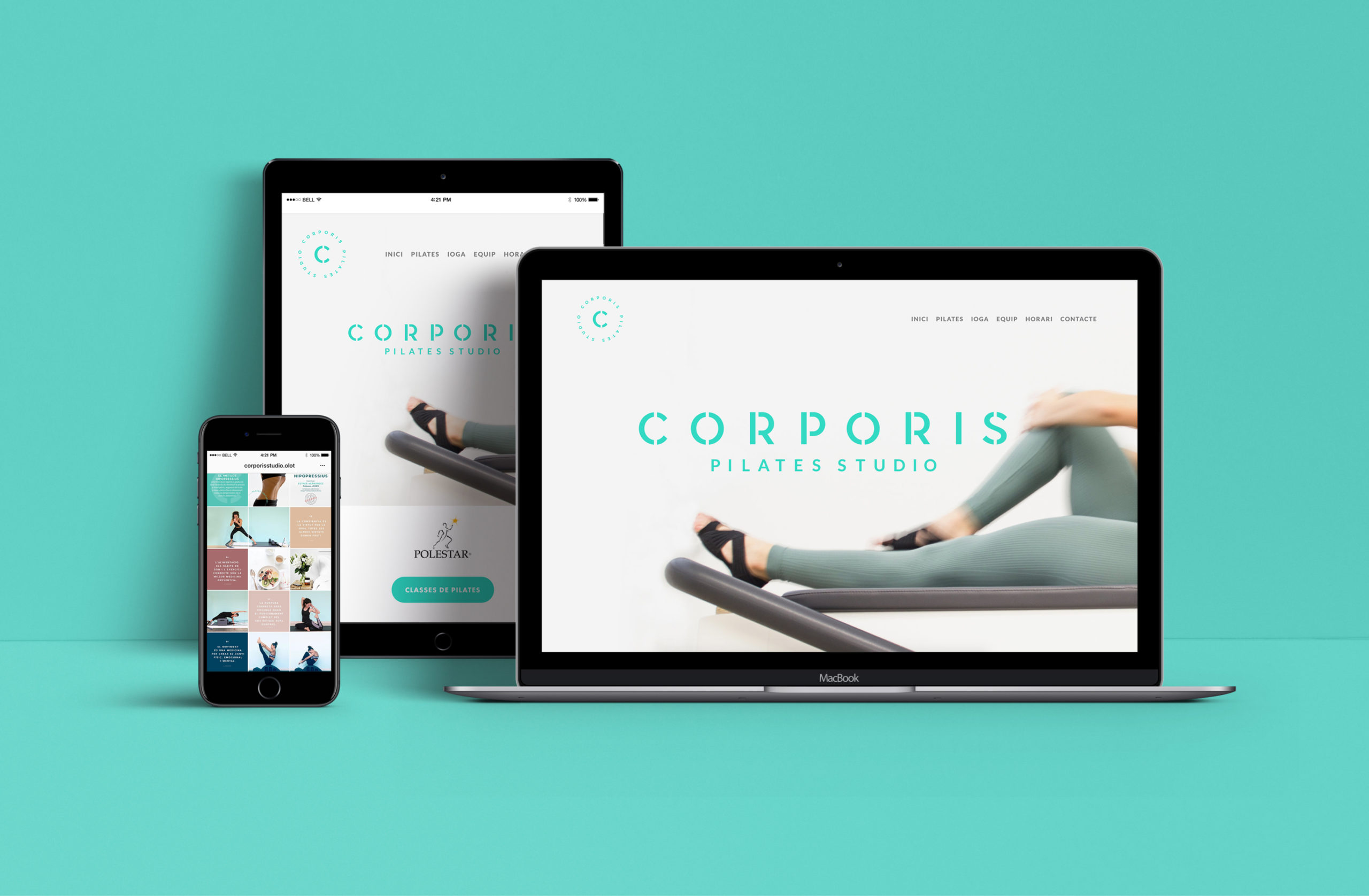
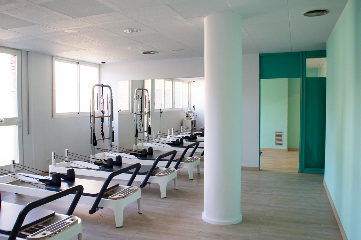
The design is inspired by the characteristic geometrical shapes of the polestar machine which shape the main logo of Corporis. The geometrical shapes are recurrent throughout the whole branding, bringing structure but also freedom. We chose a bright, bold and vibrant turquoise as the brand’s primary color, representing the owner’s vibrant and inspiring personality, and conveying peace as well as keeping the mind active and awake.
The font is a modern, structured, slightly geometric typeface that looks perfect both large and small. It adapts to all necessary designs and texts and gives to Corporis a strong and defined personality.
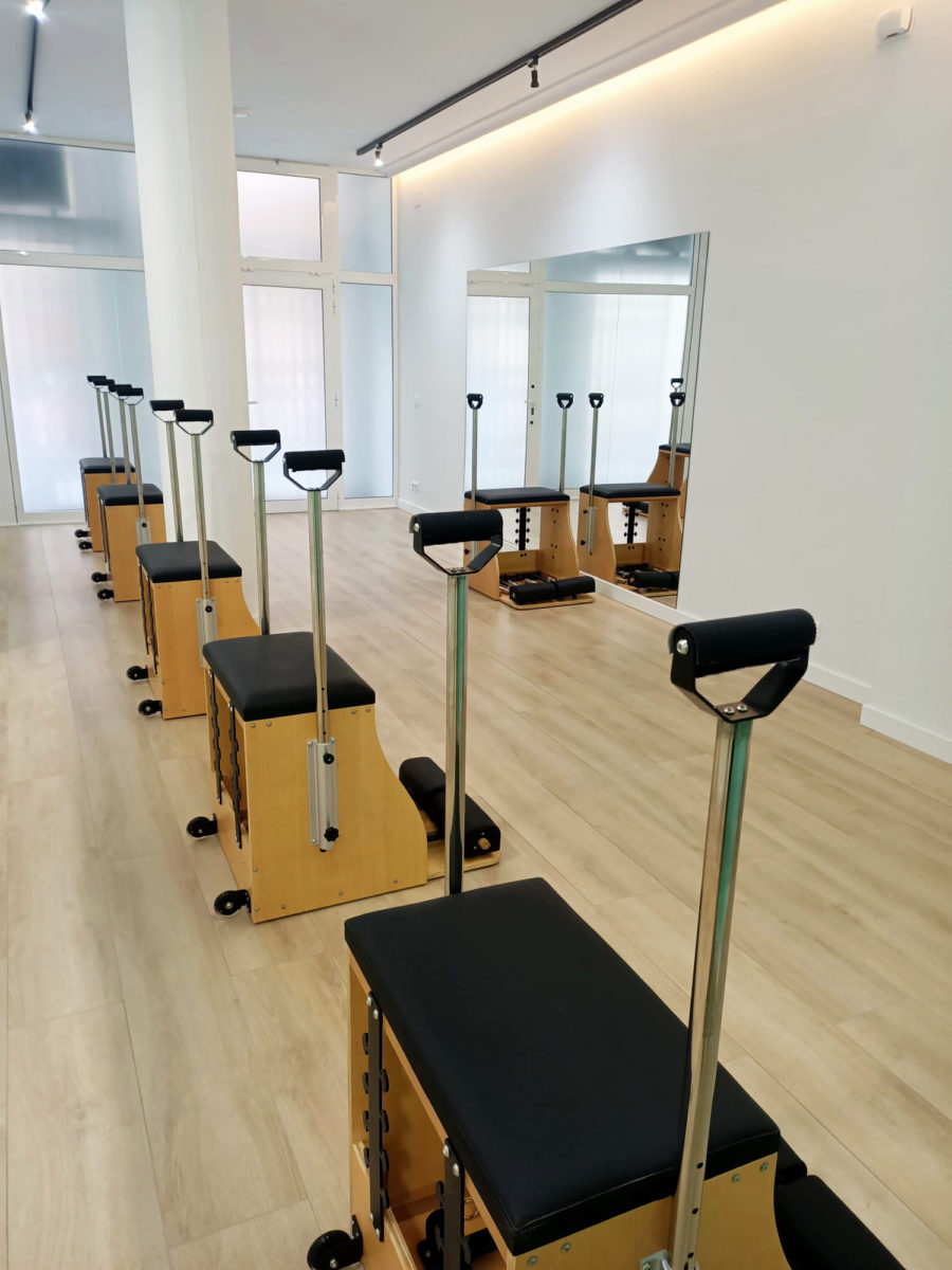
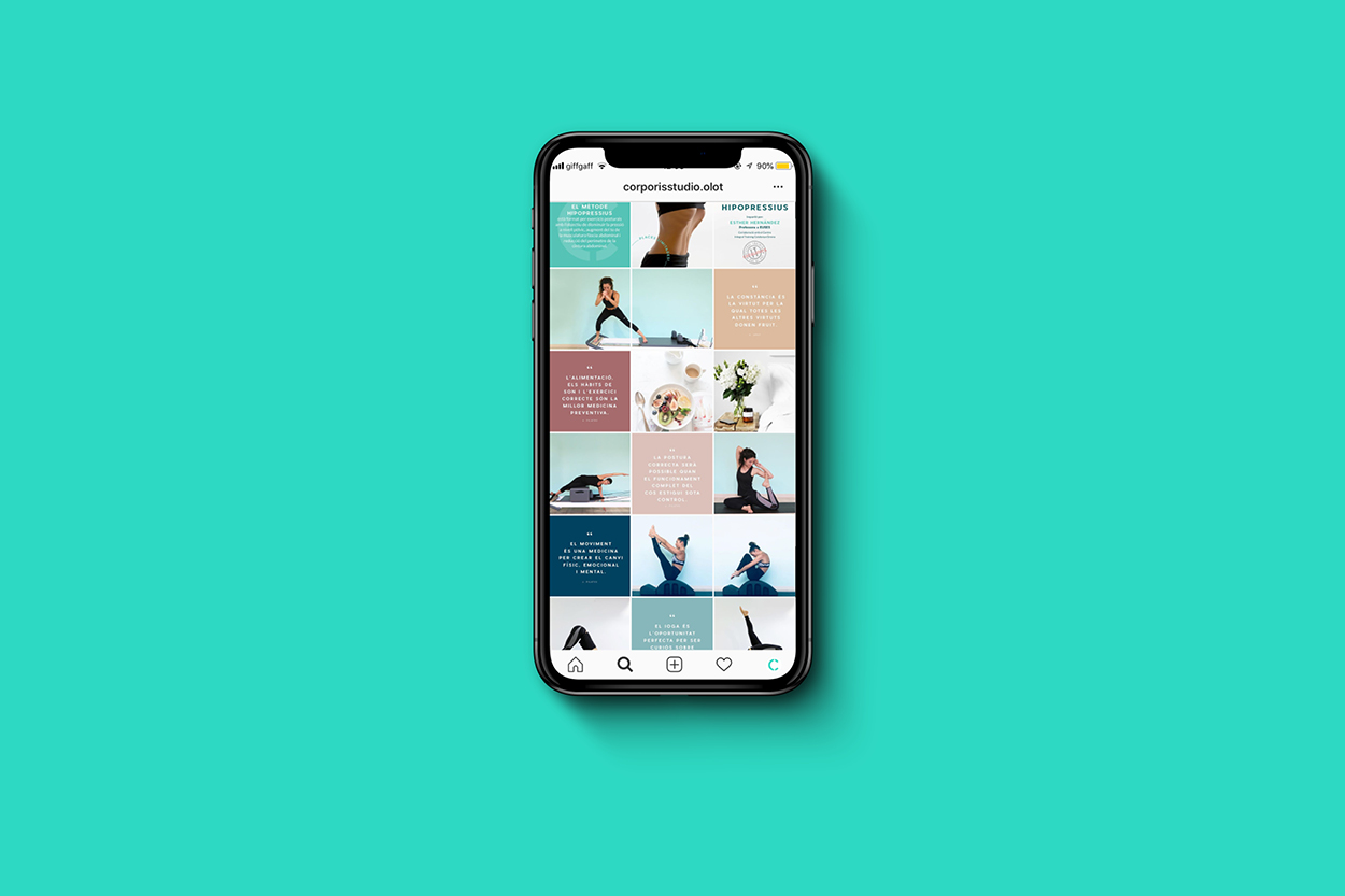
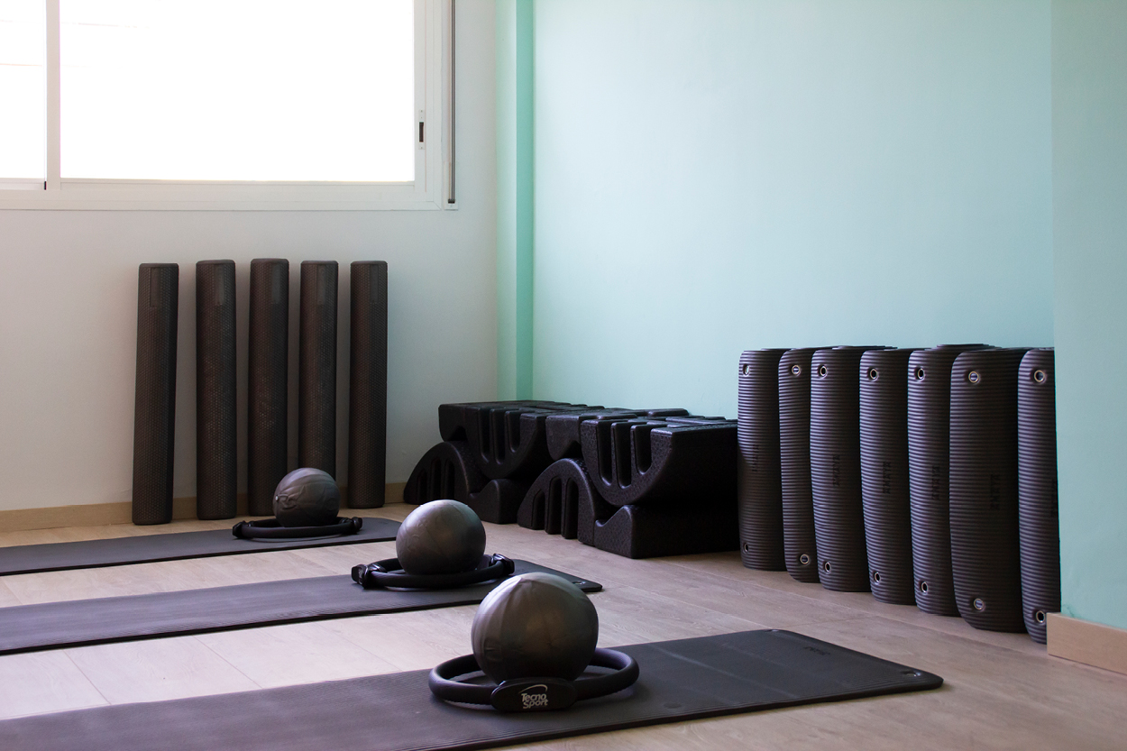
The project also includes web and social media design, advertising and interior design collaboration to create a complete and consistent brand for Corporis.