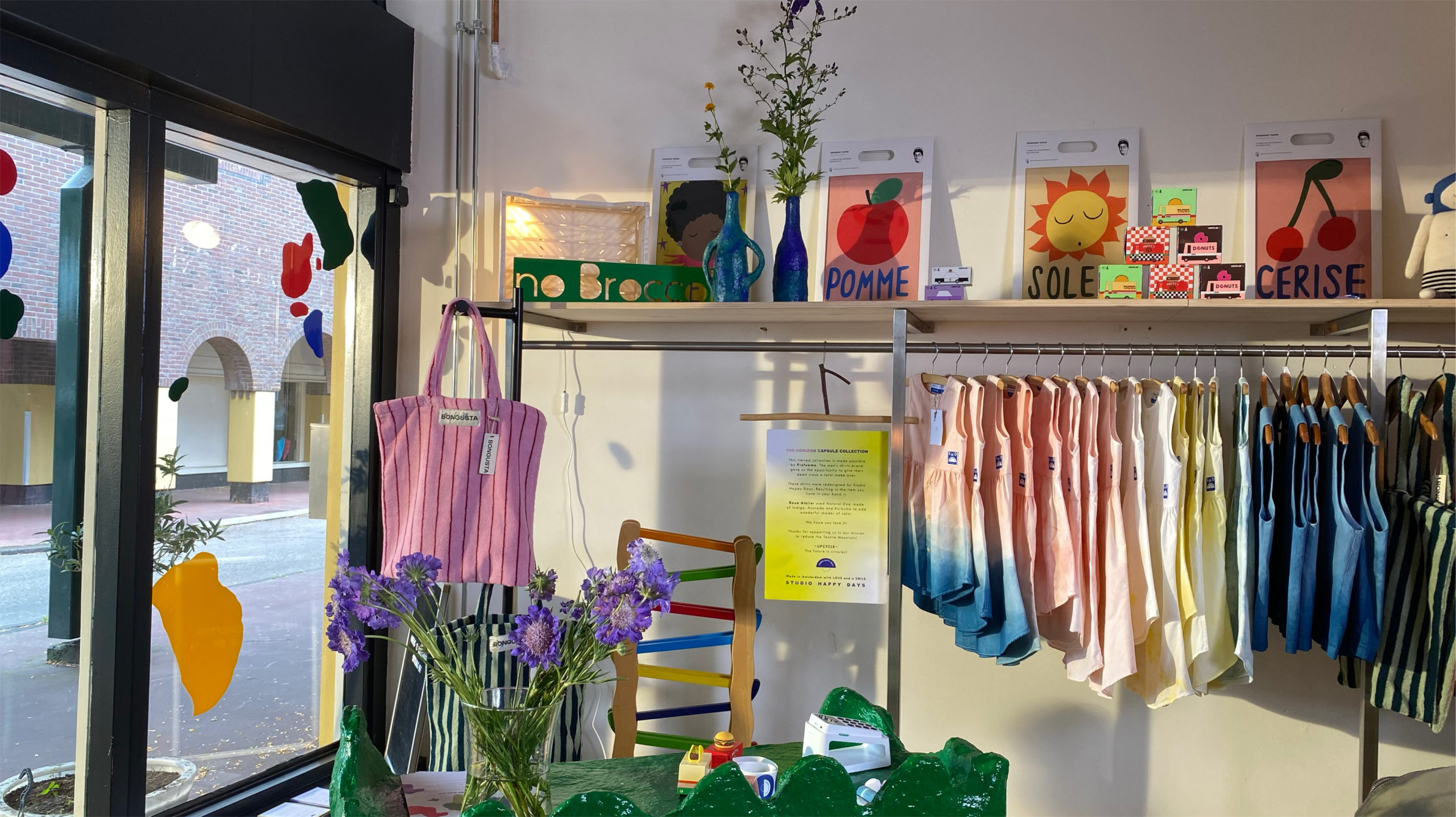
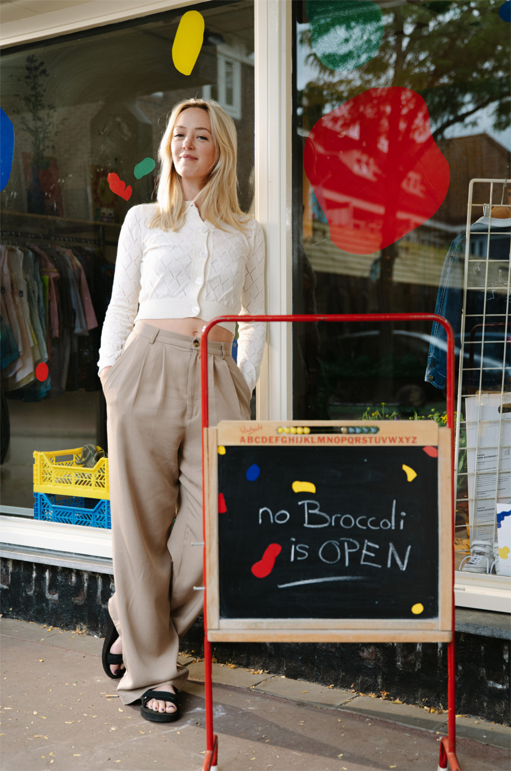
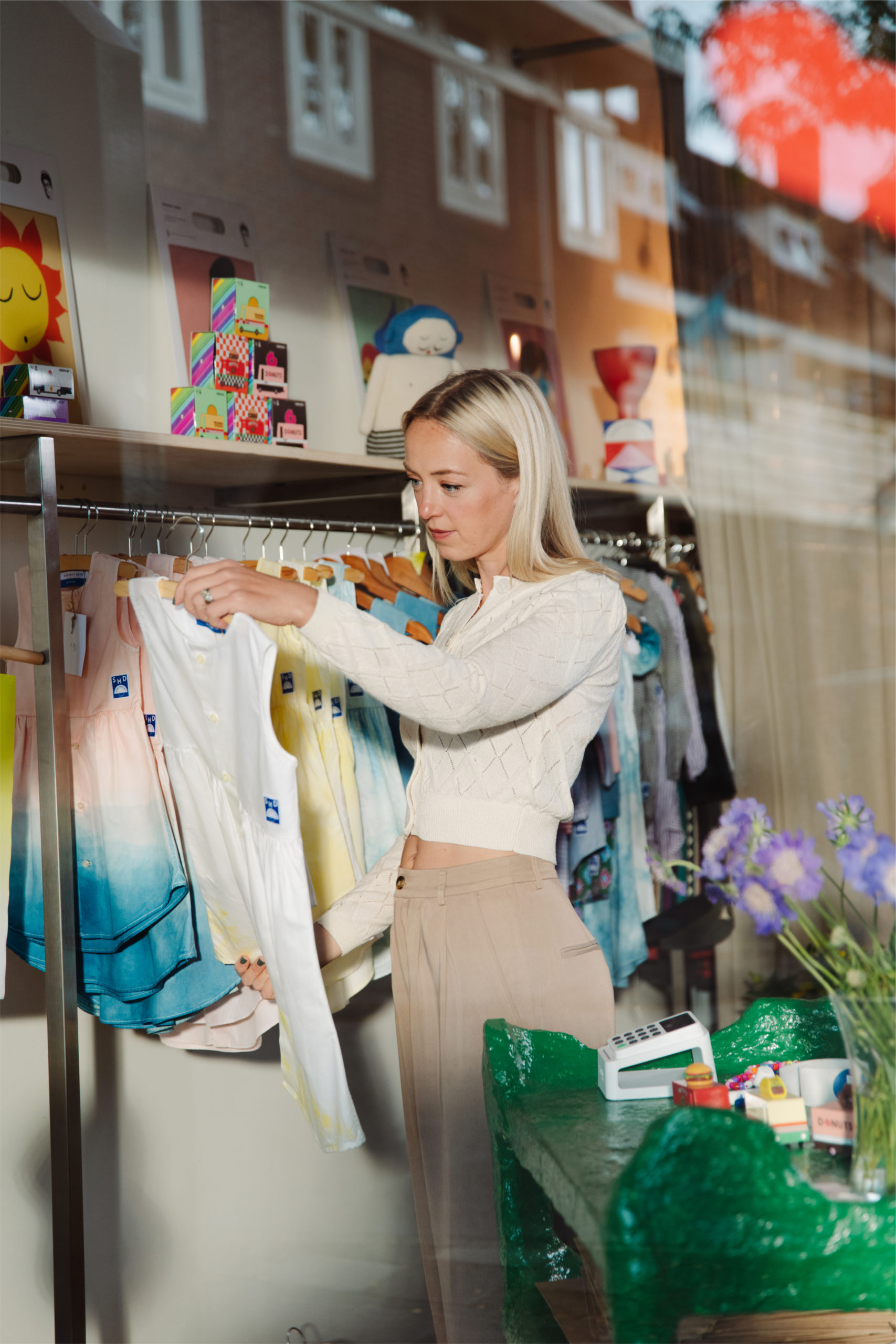
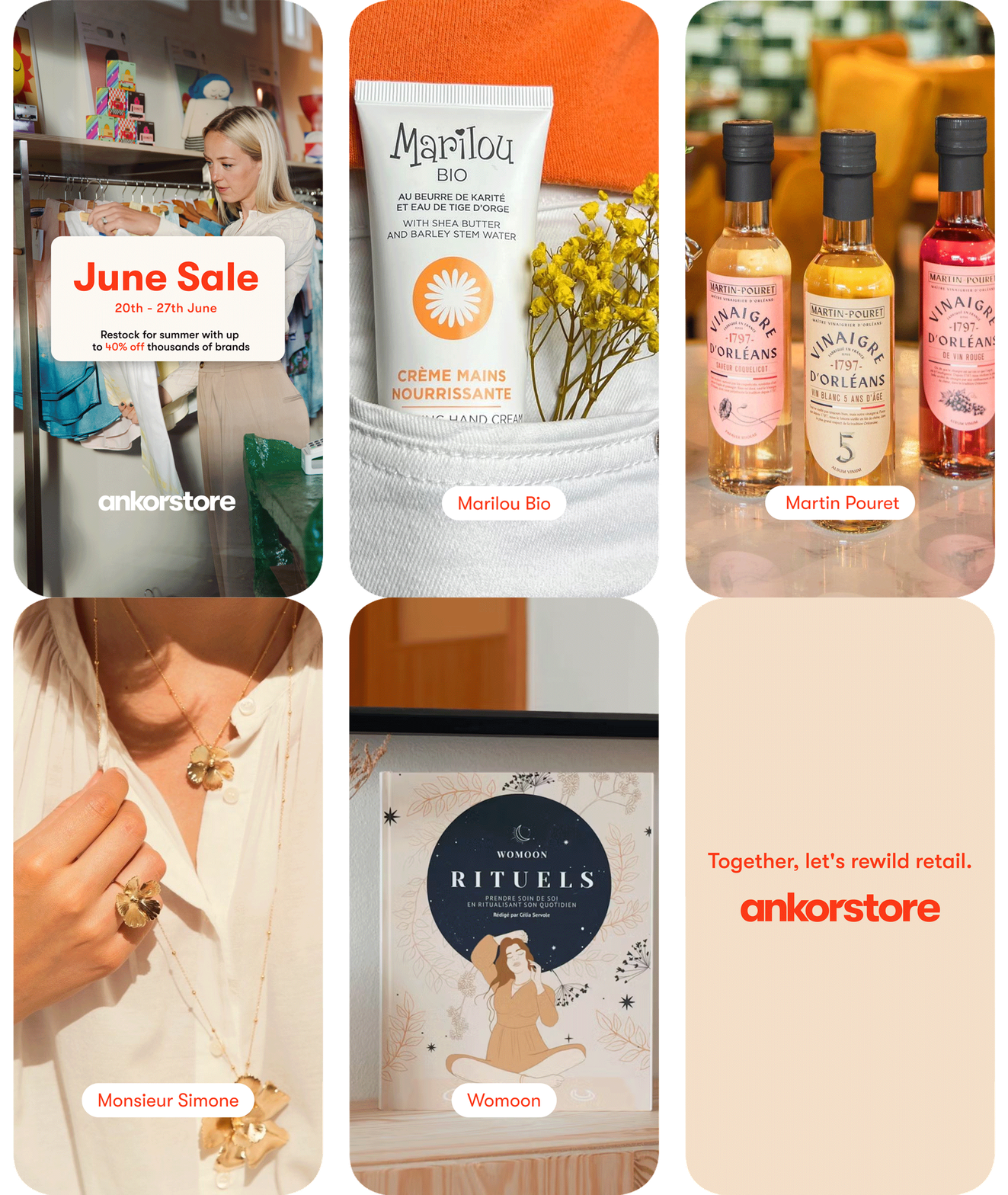
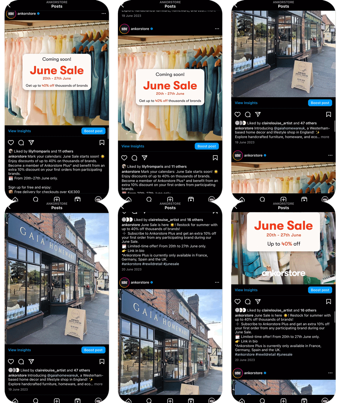
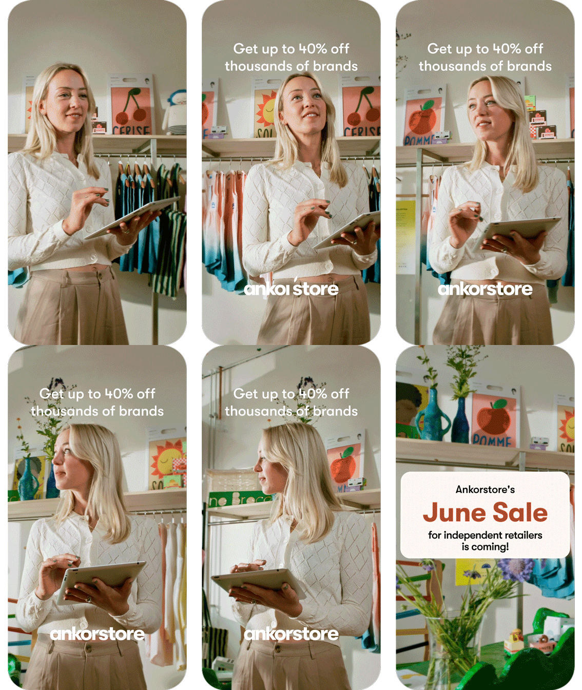
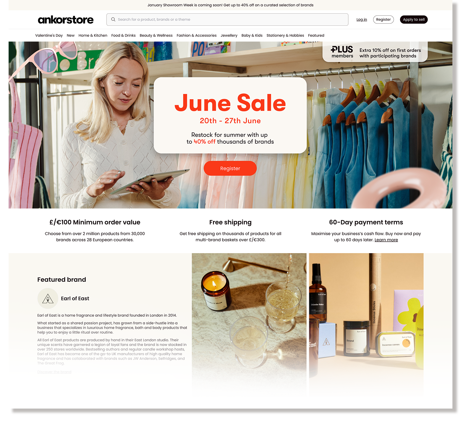
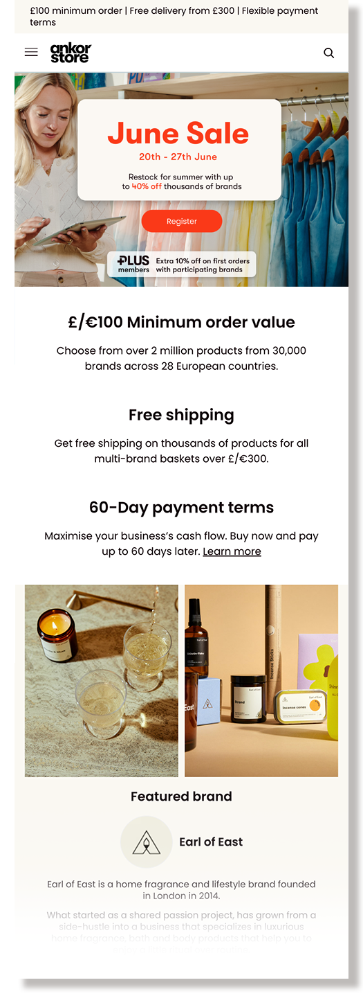
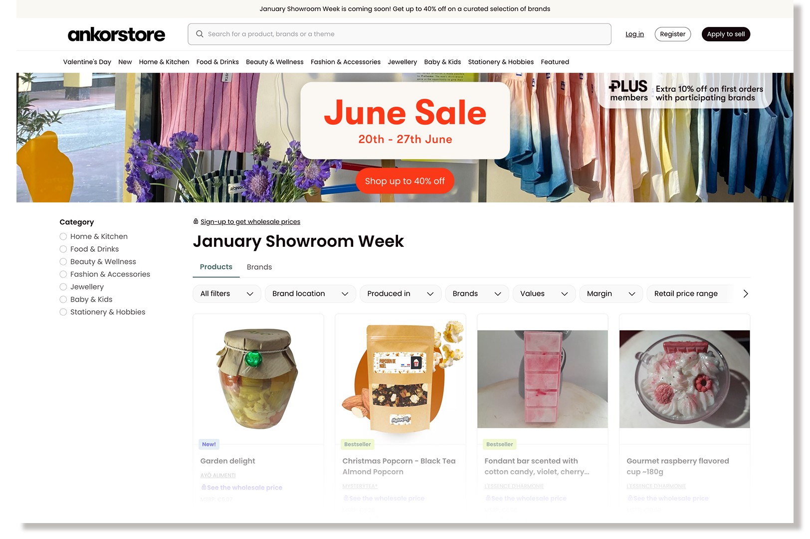
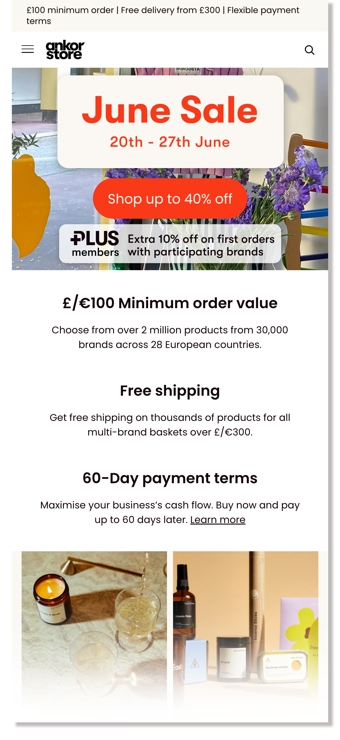
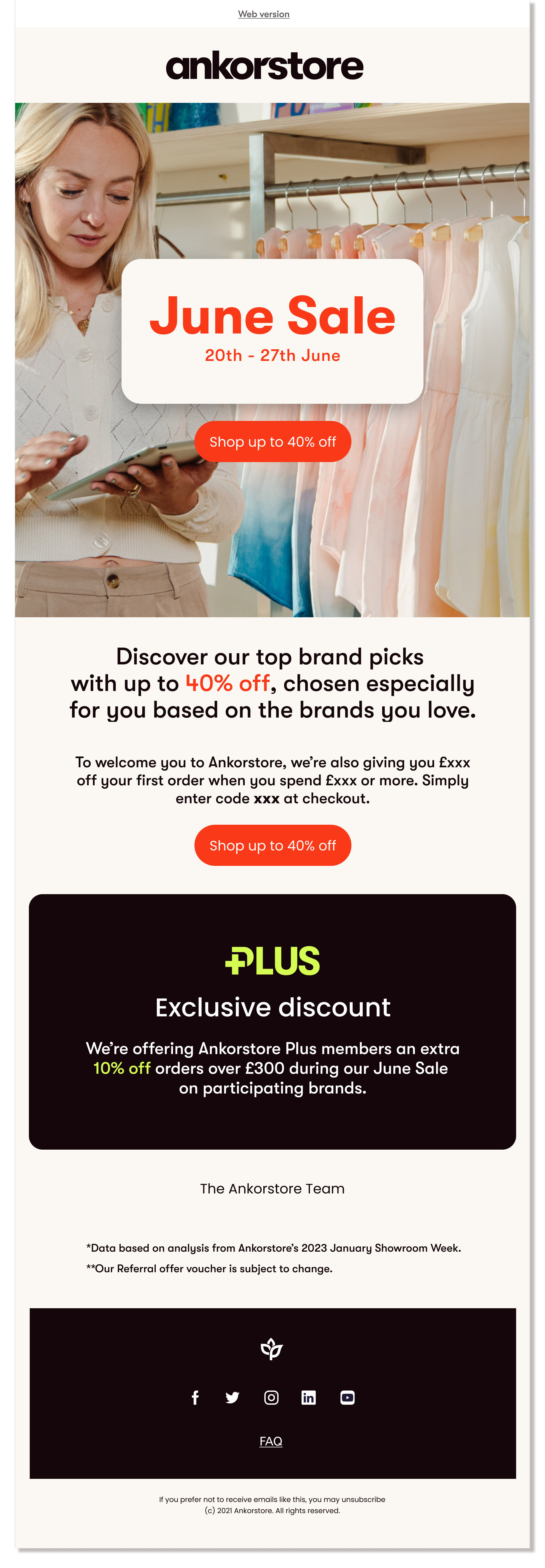
I organised a video and photo production with one of the Ankorstore retailers for the campaign in a colourful concept store with a nice summer light. The team captured the retailer while she was adding her new summer stock on her shop. In addition, I added some 3D objects which are part of the Ankorstore brand identity. On the graphics side, I used red as the main colour for the campaign since this is intrinsically related to sales and a warm secondary palette. Moreover, I added the text box to connect it to the sales labels and to make the text readable in any format.
