Paula Pons logo

GESINFLOT

LOGISTICS PLATFORM UI/UX DESIGN
2025

Logistics platform UI/UX Design. Gesinflot is a logistics platform based in Spain that uses Artificial Intelligence to optimise fleet operations. The platform’s existing interface did not reflect the user experience, so I was asked to redesign the UI for its core features and develop the brand system. The main challenge was presenting large volumes of complex data in a way that is both clear and actionable for users.

After conducting a deep analysis, I identified two main issues. Firstly, the inconsistency in the usage of color, which weakened the branding and visual hierarchy and made the user navigation more difficult. With green being one of the core brand colours (also usually used as a primary success state), it caused even more confusion. And secondly, the challenge of presenting large volumes of data clearly and at the right time.

Together with two designers, we addressed these challenges by first defining a structured color system, addressing the green colour issue. We then expanded this into a cohesive brand system including a clear typographic hierarchy, custom iconography, and standardised UI components such as buttons and inputs. The result is a unified, scalable design system for Gesinflot that significantly improves the overall user experience.

Colour palette

Font hierarchy and spacing

Icons and pictograms

Gesinflot vehicle pictograms

Gesinflot vehicle icons

Gesinflot vehicle icons

To address the data-related challenges, we redesigned the core internal interfaces to improve usability and readability. We simplified and unified screens, replaced spreadsheet-like layouts with responsive tables, and made data displays more visual. We also reduced the number of clicks required to access key information, improved navigation, and enhanced overall clarity.

Gesinflot logistics platform before and after UI UX Design

UI/UX Design of the dashboard of Gesinflot logistics platform

Home Screen

Gesinflot vehicle list UI/UX design

Vehicle list screen

UI/UX Design of the Analysis screen of Gesinflot logistics platform

Analysis screen

UI/UX design of the tacografo screen of Gesinflot logistics platform

Tacograph screen

UI/UX Design of the chat screen of Gesinflot logistics platform

Chat screen

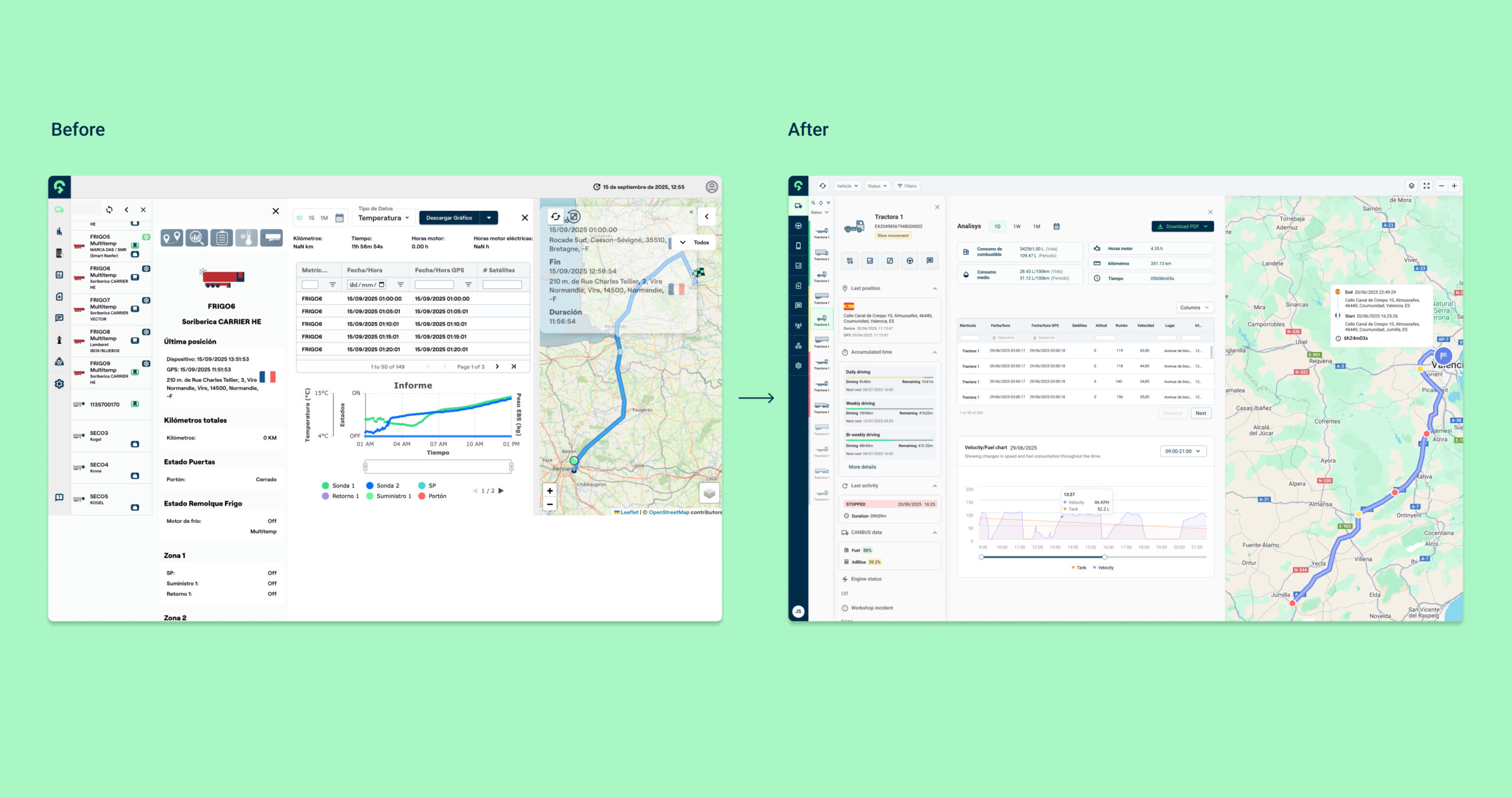
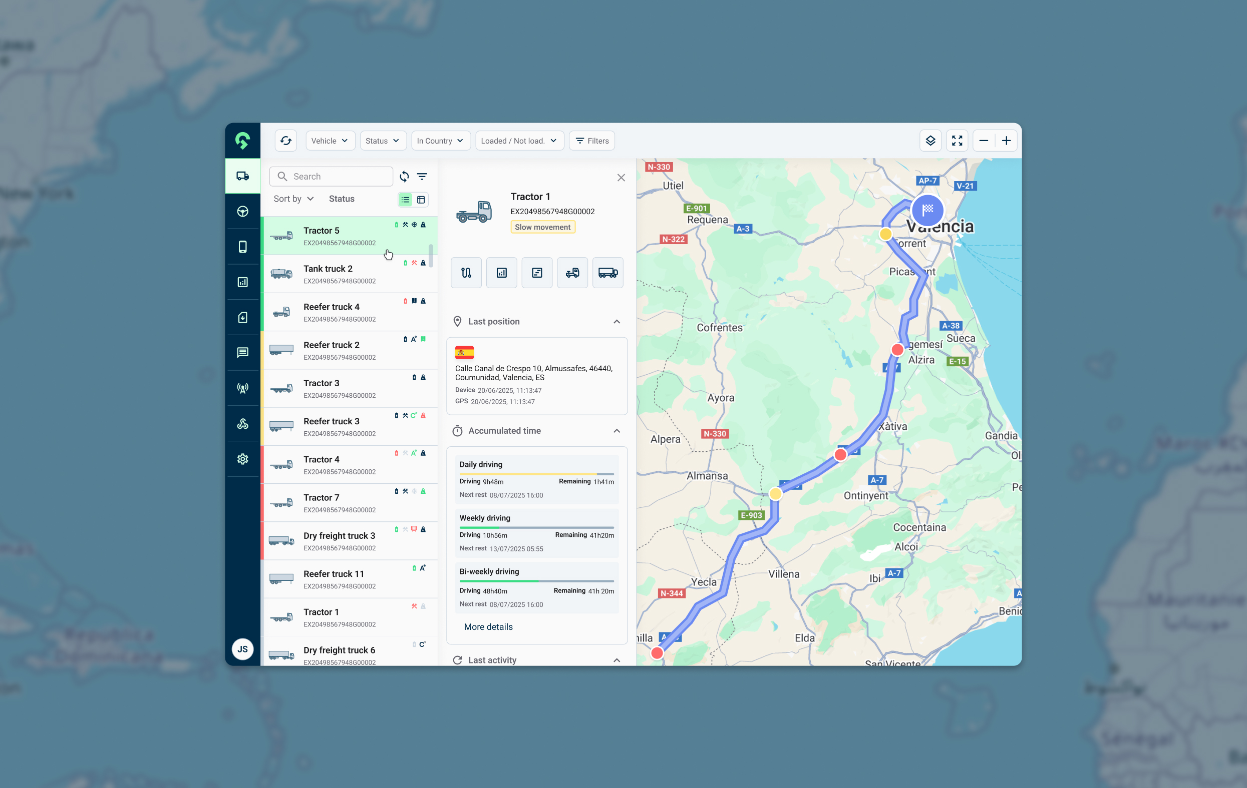
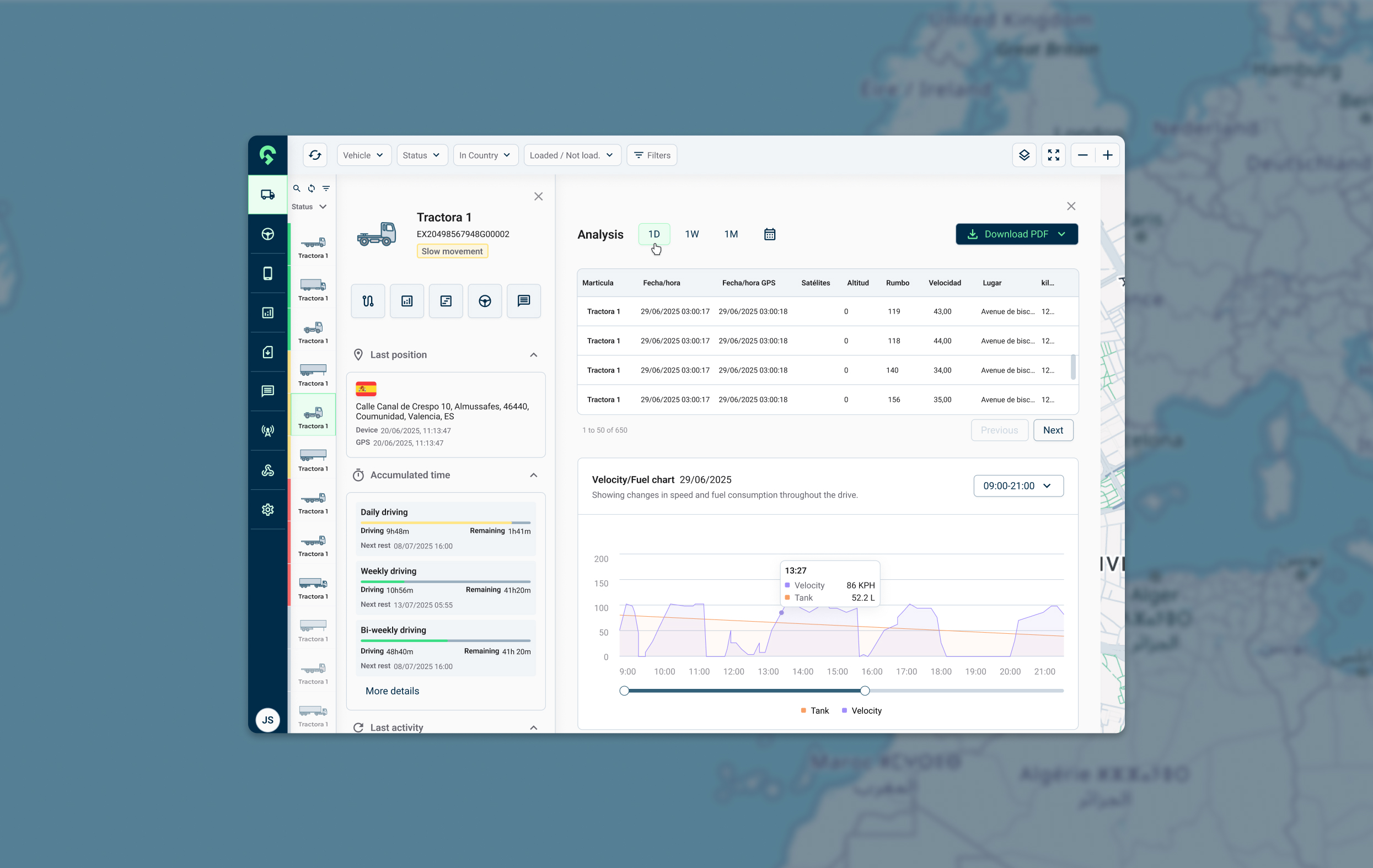
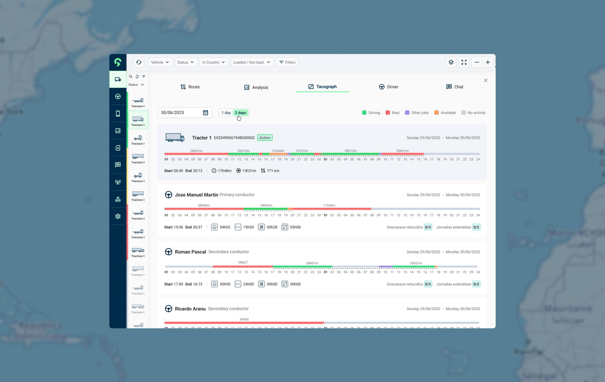
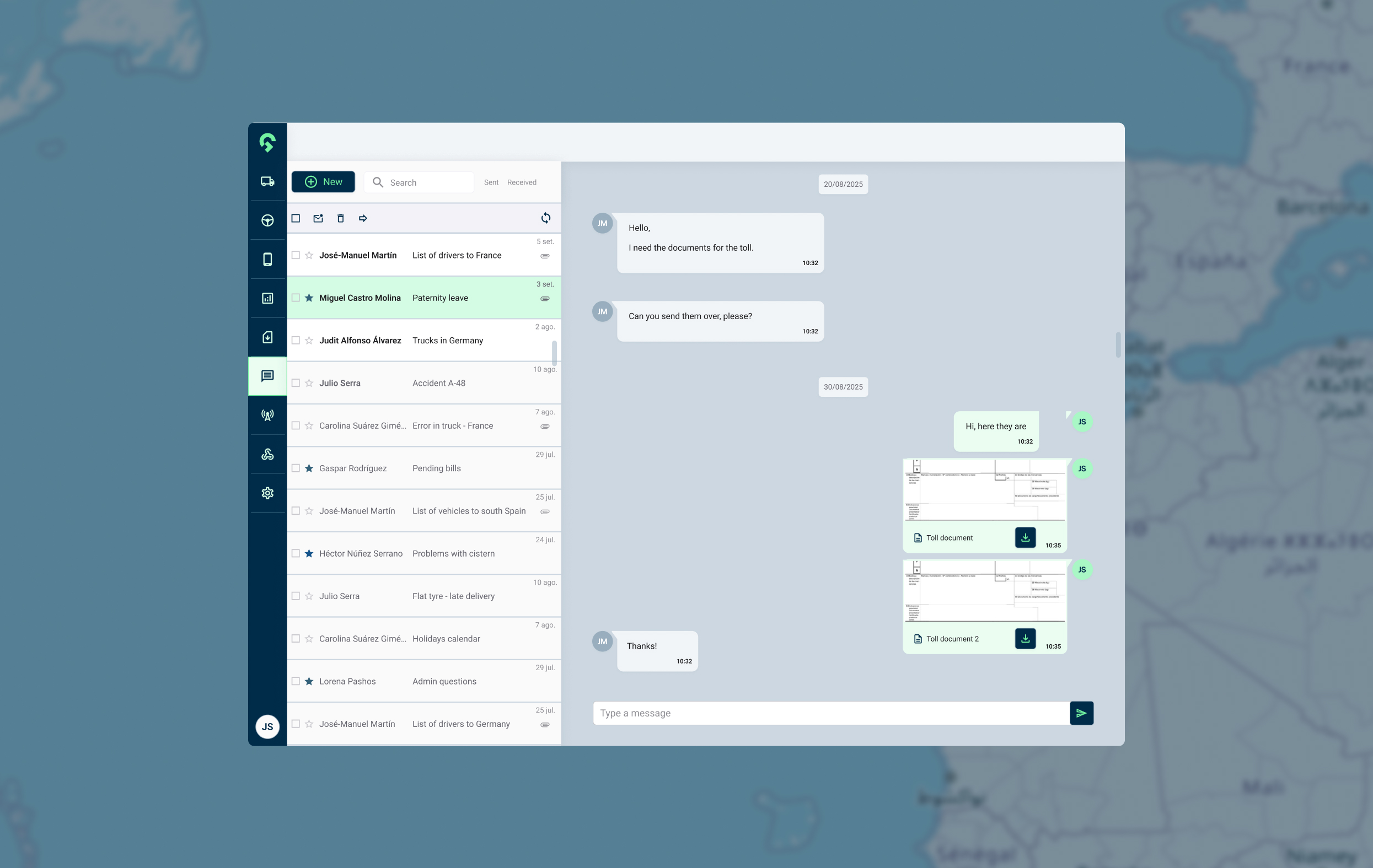
Additionally, we made Gesinflot’s platform highly customizable, allowing each user to select the types of data they want to view based on their needs. The result is a cohesive, accessible, user-centered platform that transforms complex vehicle data into clear, actionable insights, enabling users to access and manage information more efficiently.