Paula Pons logo

CARAVANAS ARURE

BRANDING
 
2023-2024

Caravanas Arure branding is a project for a family-run business based in the Canary Islands, specialising in the sale and rental of motorhomes, as well as a wide range of camping equipment. The branding project aimed to revitalise Arure Caravanas’ visual identity, updating it to better reflect today’s market and audience.

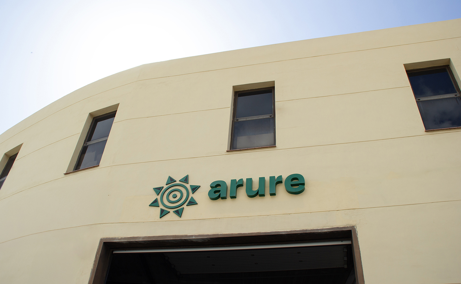
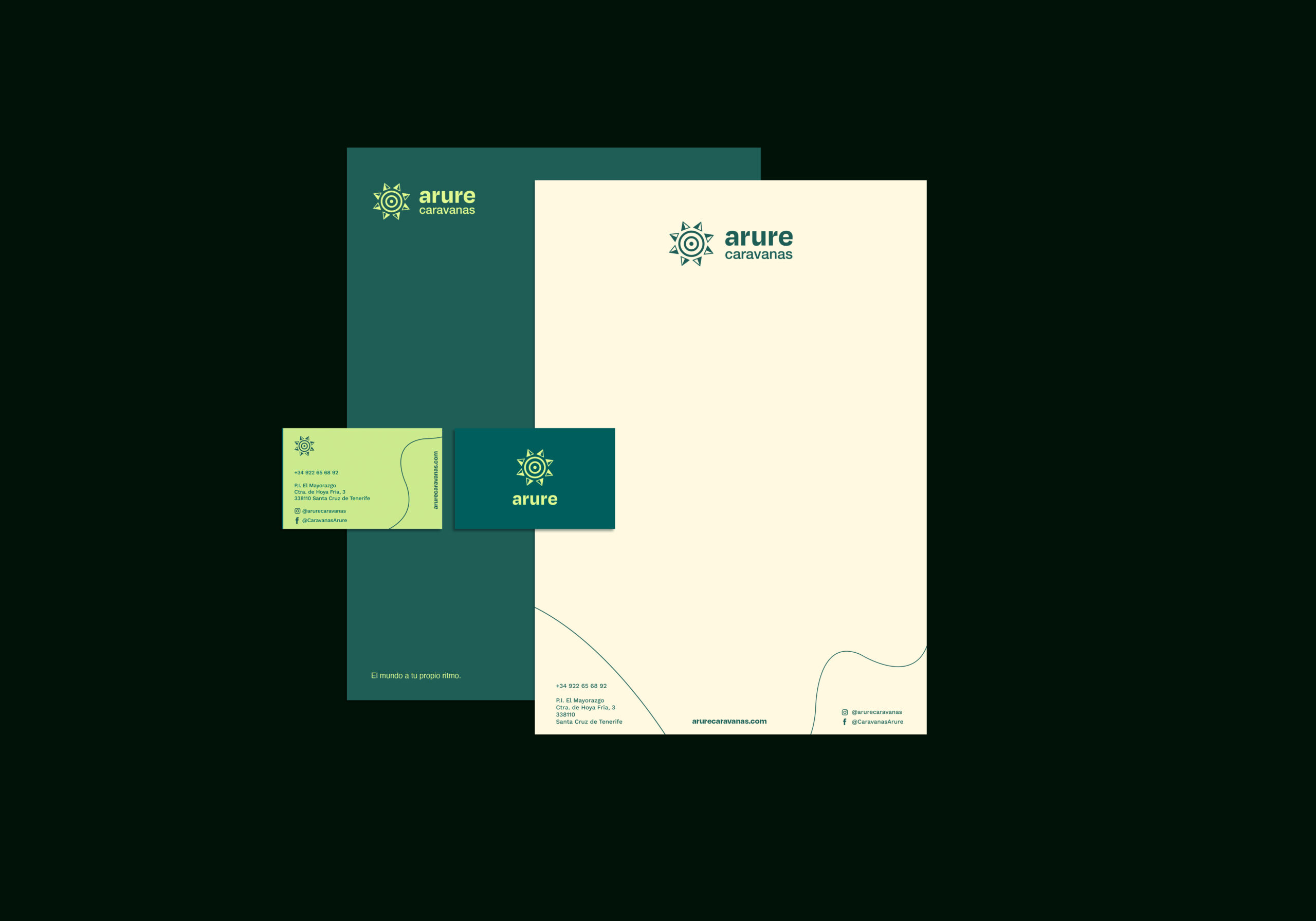
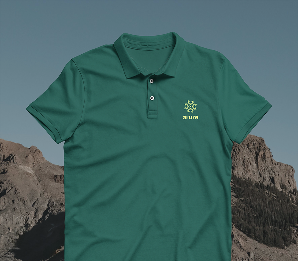
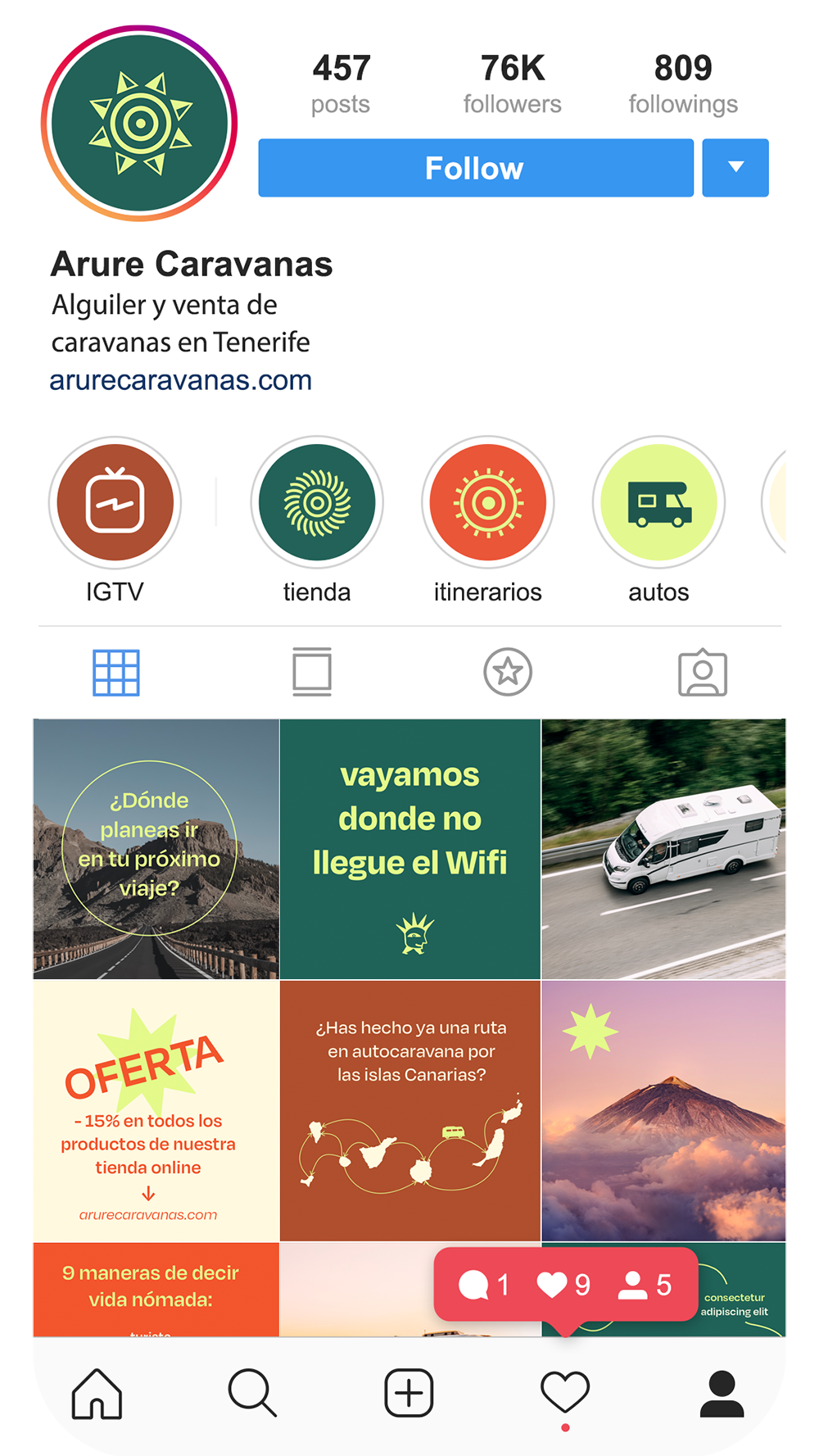
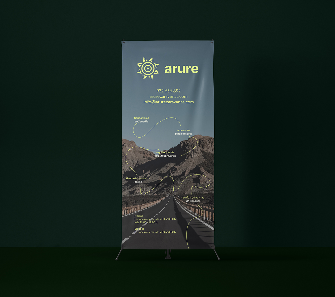
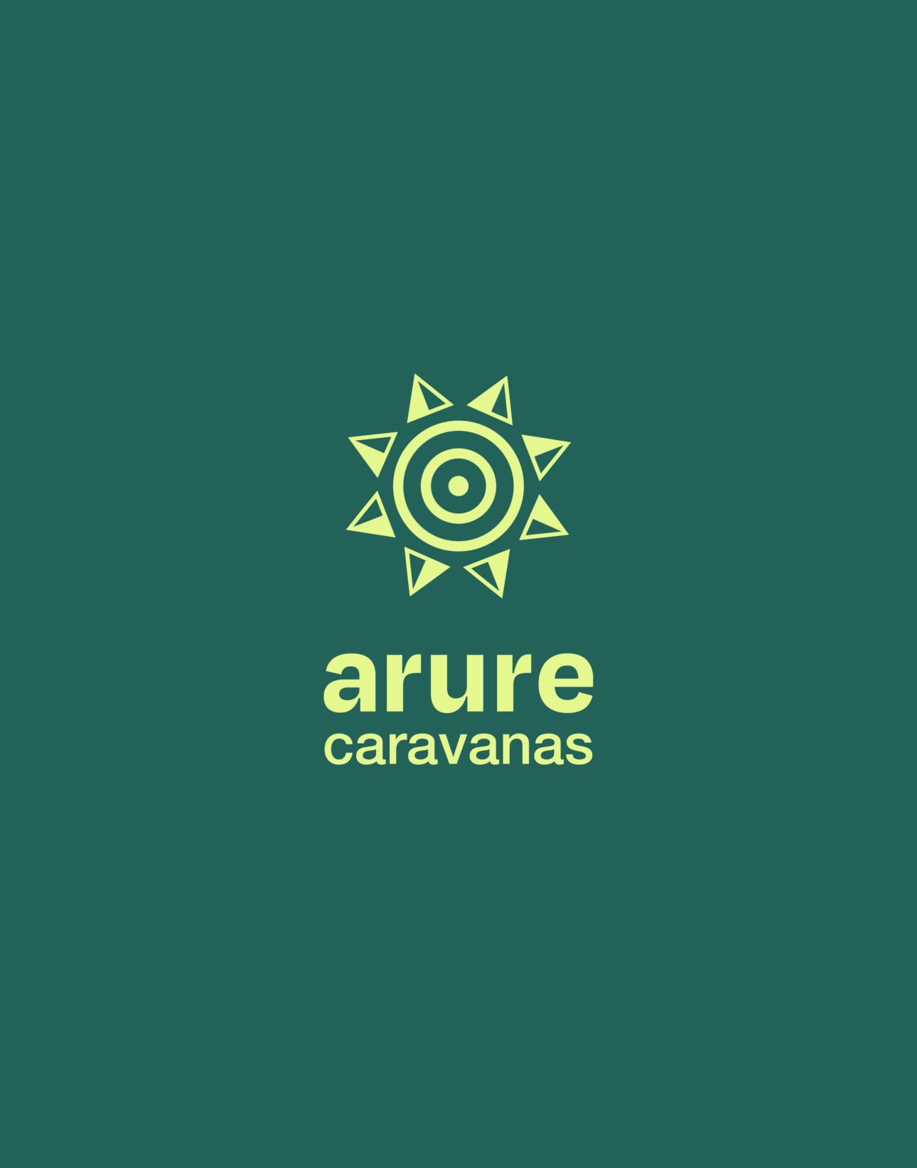
I centred the logo around three core elements: a Guanche symbol that honours the indigenous heritage of the Canary Islands, a compass that embodies guidance and discovery, and a wheel that signifies movement and exploration. United, these elements express the spirit of travel and reflect the company’s dedication to inspiring meaningful journeys.

For the typography, I chose Degular for its clean, modern aesthetic that balances professionalism with warmth. Its approachable nature and refined details provide both clarity and character across every medium — from digital platforms to print — giving the brand a cohesive and personable identity.

The colour palette retains the brand’s signature deep green as its foundation, complemented by hues inspired by the Canary Islands’ natural landscapes — from volcanic earth and coastal sands to the golden tones of island sunlight. This expanded palette strengthens the brand’s connection to its environment and evokes the sensory richness of exploring the islands.

The imagery captures the freedom and spontaneity of life on the road — the sensation of waking up in a new place each day, immersed in nature. It carries a gentle vintage touch, inviting a pause from the digital world and a return to the tangible, analog pleasures of the physical world.

The outcome of Caravanas Arure Branding is a revitalised identity that feels both rooted and adventurous — a visual system that celebrates exploration, freedom, and the joy of life on the road.

Design by Paula Pons. Project featured in the World Brand Design Society.