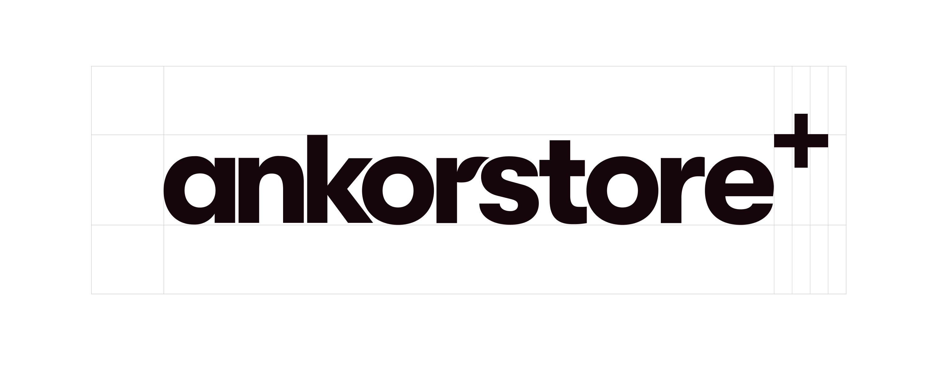
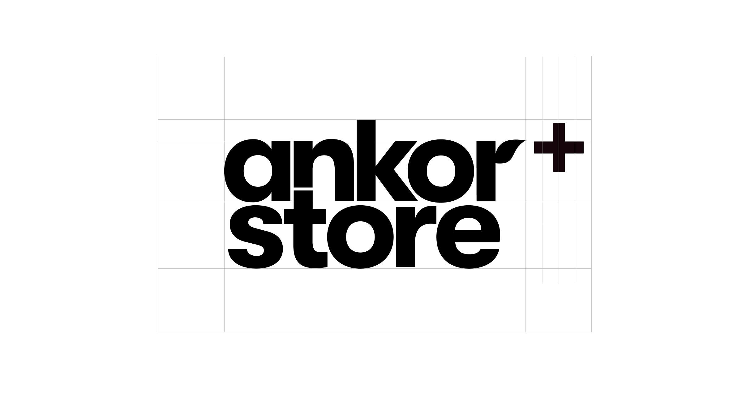
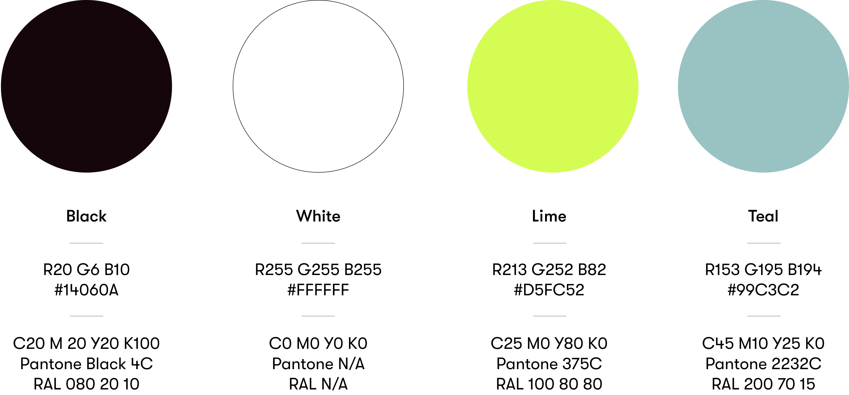
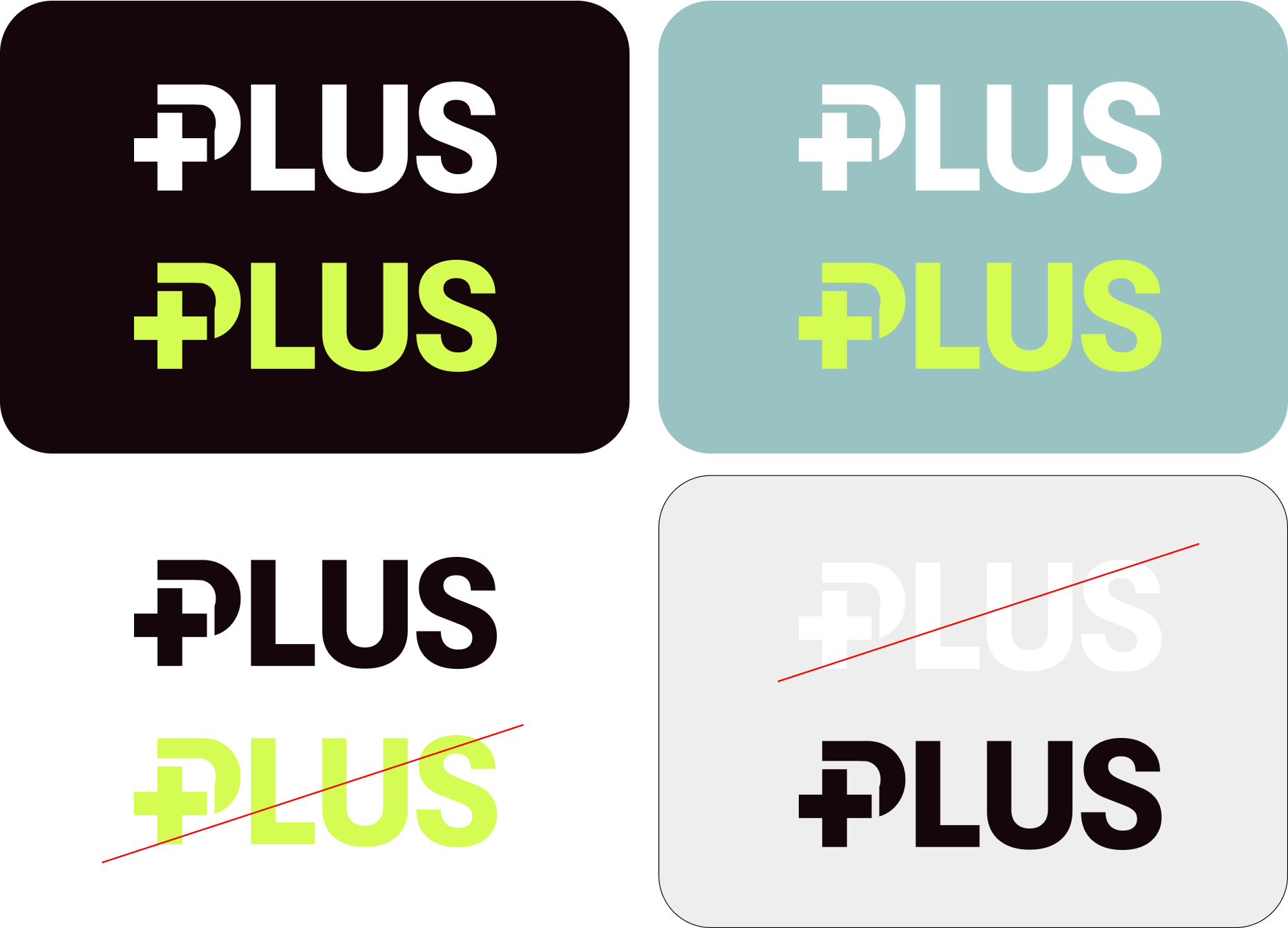
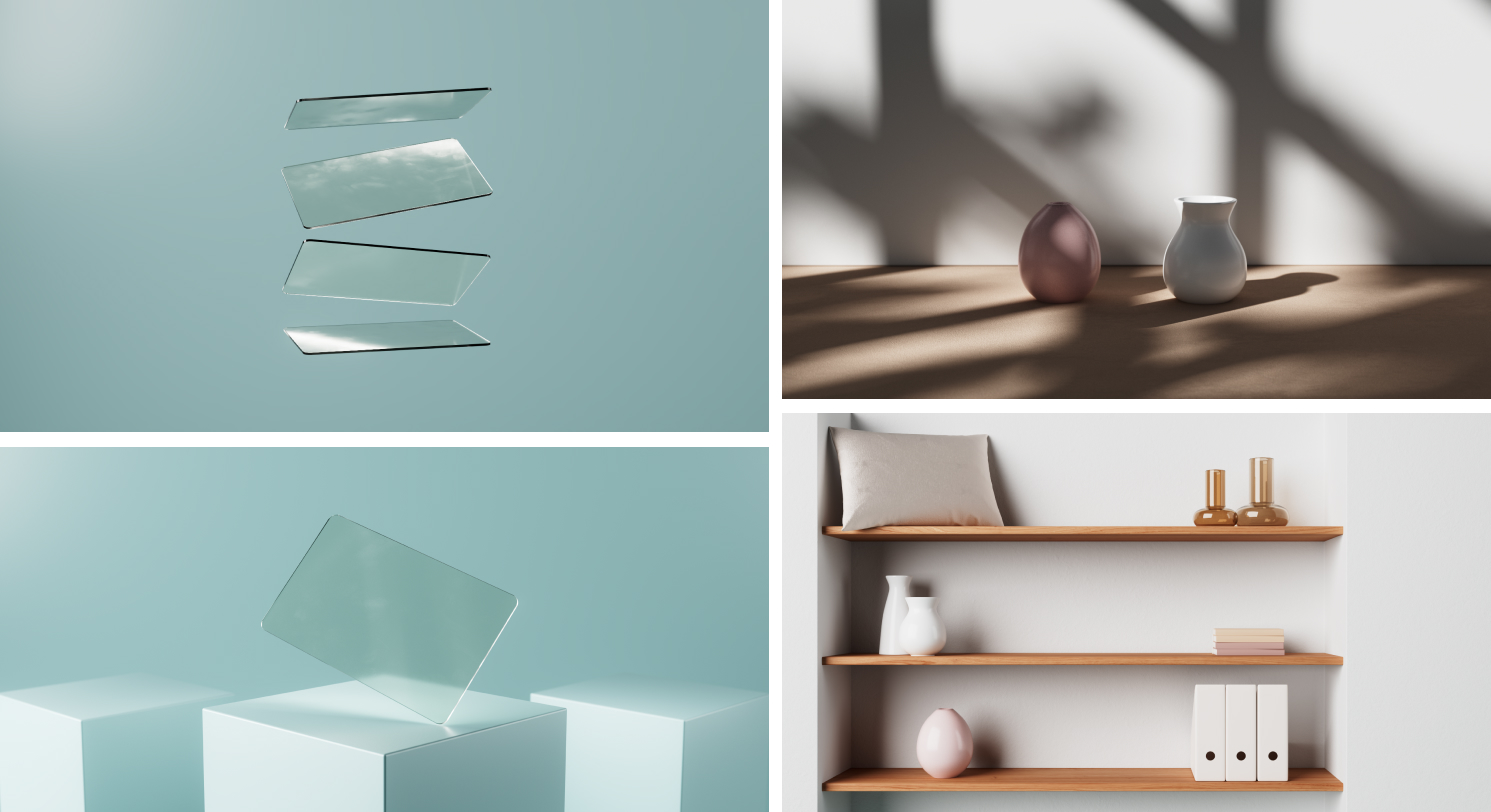
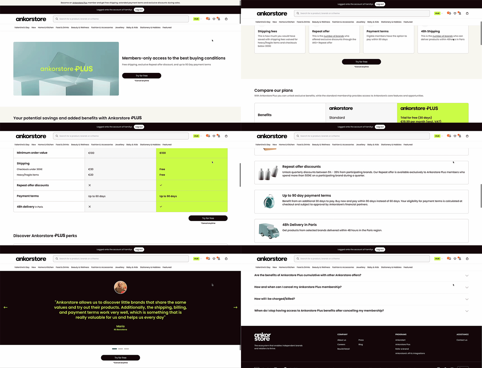
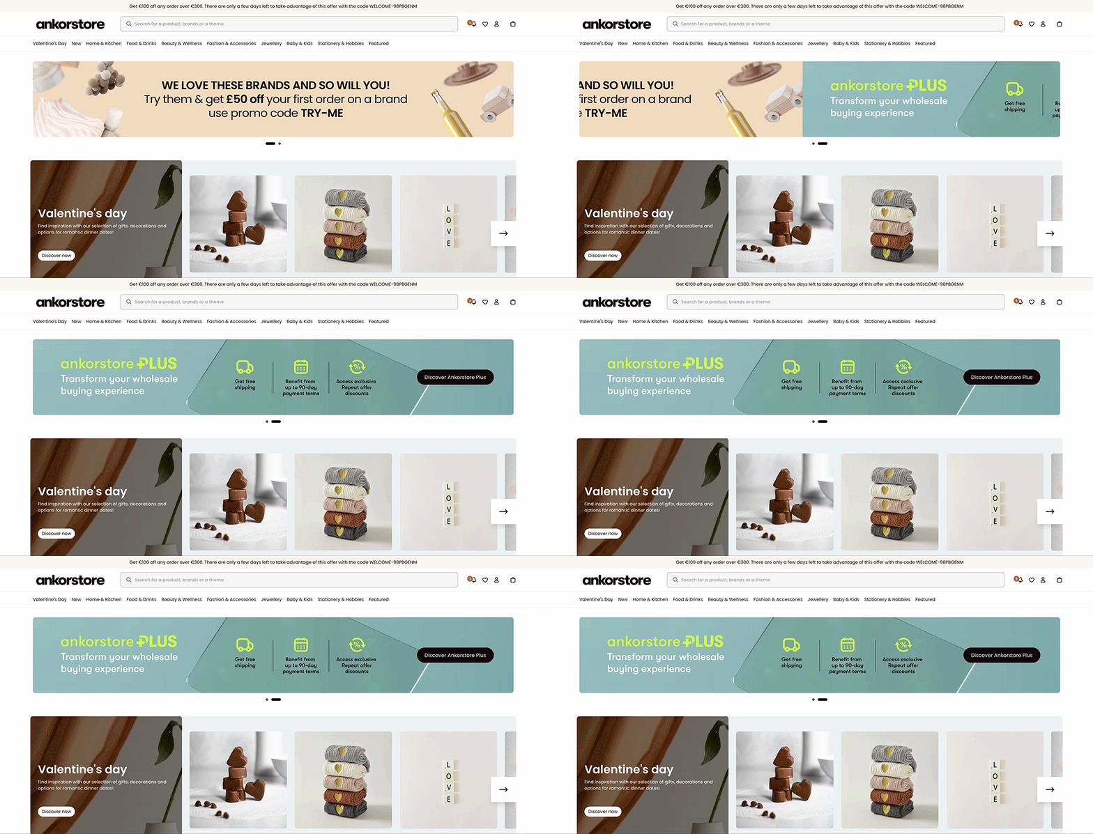
The sub-brand’s colour palette is a reduced version of the main Ankorstore palette. Likewise, the logo is based on the Ankorstore logo with the addition of the plus symbol or word. The icons and illustrations were created specifically for this sub-brand and follow the direction of the main brand. All these elements create a distinctive identity while still being recognisable as part of Ankorstore.
Above all the challenge was the amount of information of this program. The solution was to present it in a way that is easy to understand and also has a narrative that you would want to be part of.
